04/12/2025 • Andrew Lowdon
How to Keep Your Pages Consistent Across Campaigns
CRO & UX Article


Introduction
Consistency is one of the strongest signals of trust that a SaaS brand can communicate. When visitors arrive on a landing page, their minds begin scanning for patterns before they even read a line of text. If every part of the page follows a predictable design logic, they can understand the product faster. This reduces mental effort and naturally leads them toward action.
A design system helps teams create this consistency at scale. Without a shared system, pages slowly drift apart as different departments make small adjustments. One team might lighten a colour slightly to improve contrast. Another might adjust heading sizes to fit a shorter headline. These changes seem harmless in isolation, but they add up to a fragmented experience that weakens brand trust.
In this post, we will explain how a SaaS design system maintains consistency across landing pages, why it brings both creative and operational benefits, and how teams can adopt it even if they start from a simple foundation.
Share it with friends
Step 1: Design Strong Global Styles for Visual Alignment Across All Pages
Global styles form the backbone of a design system. They are the rules that guide typography, colours, spacing, and layout.
Many teams underestimate how strongly these global styles influence user behaviour. People rely on cues such as text size, line spacing, colour contrasts, and element hierarchy to understand what to focus on.
Considering that the average attention span on any screen is only about 47 seconds, inconsistent cues can confuse visitors and make your brand feel unreliable, increasing the risk that they leave before engaging with your content.
Define Typography for Clarity and Hierarchy
Typography influences readability, emotional tone, and perceived authority. Begin by creating a simple scale for headings and body text. Most of our clients work well with the following:
- Main headings are around 48-64 pixels
- Secondary headings are around 36-48 pixels
- Supporting headings around 24-32 pixels
- Body text between 16-18 pixels with a line height of around 1.5
This creates a natural rhythm that the eye can follow without effort.
A common mistake is adjusting heading sizes to fit a layout. Like shrinking a main heading because the copy is short or enlarging a smaller heading to fill an empty space. These changes disrupt the hierarchy and make the page feel slightly off.
Consistency in typography makes users instinctively know which sections carry more importance. This lowers cognitive load and helps them absorb information faster.

Set Colour Rules That Reinforce Brand Identity
Your colour palette sends signals about the product before any copy does. Assign each colour a clear purpose, such as primary, secondary, background, accent, and interactive states.
Do you notice this happening on your team? One person might lighten a button colour for a hover effect, another might copy a colour from a compressed screenshot, and someone else might apply a filter to boost contrast. Before long, the palette turns into a mix of near matches that feel inconsistent when used together.
With a design system, hover states, background shades, border colours, and text contrasts are defined once and followed everywhere. This strengthens recognition and makes the brand feel dependable.
Apply Consistent Spacing to Build Comfort
Spacing is one of the most overlooked parts of visual consistency. It affects how open or cramped a page feels. Every margin and padding value should be specified in this unit. For a grid system spacing, follow these:
Column Spacing
- Standard grid gutters use 30px between columns
- Wide grid gutters use 40px between columns
- Narrow grid gutters use 20px between columns
- No gutter layouts use 0px for image galleries and similar setups
Row Spacing
- Grid rows typically range from 40 to 60px
- Dense grid rows sit around 20 to 30px
- Feature grid rows sit around 60 to 80px
- Testimonial grid rows stay at 40px
Without spacing rules, pages feel messy even when the content is strong. Buttons sit too close to headings. Sections appear uneven. Cards look misaligned. This lack of order creates friction that influences trust. This can be solved by applying spacing values that are already tested for comfort and readability.
Step 2: Build a Reusable Library of Components for Fast and Consistent Page Design
Consistency is not achieved only through typography and colour profiles. It also comes from using reusable components. These are pre-built design sections that already follow your brand’s visual standards.
Think of your website as a collection of modular blocks: hero sections, testimonials, pricing tables, product overviews, and call-to-action strips. When these components share the same foundation, your team can combine them in different ways without losing visual harmony.

Standardise Hero Sections Across Campaigns
Create one approved hero section in Figma or Elementor. It should include the correct heading sizes, spacing structure, image placement, and button styling. Once saved as a reusable block, it becomes the starting point for every new campaign.
Below is an example of our site’s reusable components. You can view everything at a glance and easily copy each component.
Designers simply replace the headline, subheading, and image without touching the layout. This prevents small tweaks that cause pages to drift away from the standard.
Apply the same principle to testimonials and pricing sections. Consistent layouts make it easier for users to compare information and trust what they see.
A bad practice would be when teams build “custom” versions of components to speed up development. A developer might hardcode a pricing table directly into a page instead of using the shared component, reasoning that it’s a one-off layout.
Another designer might tweak the testimonial layout for a regional campaign to better fit translated text. These shortcuts create similar but separate versions that slowly drift from the master library.
Reusable components reduce errors and speed up delivery
From a development perspective, components save hours of repetitive work. Instead of coding layouts from scratch, developers reuse tested modules for performance and responsiveness. This reduces errors, speeds up QA, and creates cleaner code across projects.
For marketers, reusable components reduce decision fatigue. They no longer guess which layout to use. They select from a library of approved blocks and focus on messaging rather than design decisions.
Step 3: Keep Teams Aligned Through a Single Source of Truth
Even the most detailed design system will not work if teams do not follow it. True consistency comes when designers, developers, and marketers agree to work from a single central source.
Assign Ownership and Centralise Assets
Start by assigning clear ownership. One team should manage the design system, update rules when necessary, and communicate any changes to others. This avoids confusion when new brand elements are introduced.
Next, store everything in one accessible place. Whether it is a shared drive, a Figma workspace, or an internal knowledge base. Everyone should know where to find the latest version of:
- Global styles
- Component libraries
- Usage rules
- Code snippets
- Sample templates
If multiple tools are in use, link them together so no one works with outdated files.
Hold periodic reviews. Once a month, review new landing pages and compare them to your standard. Check if spacing, typography, and colour use still match your system. These reviews do not need to be strict design audits. They should be collaborative discussions where teams identify what is working and what needs refinement.
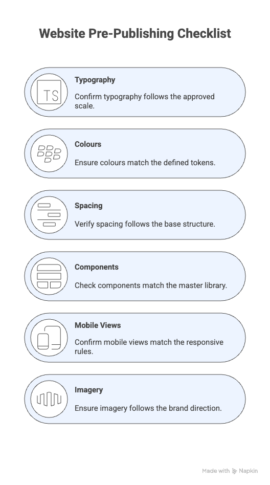
Use Checklists to Maintain Quality Before Publishing
We made a checklist to help teams stay consistent and avoid last-minute mistakes. Before a page goes live, confirm the following:
- Typography follows the approved scale
- Colours match the defined tokens
- Spacing follows the base structure
- Components match the master library
- Mobile views match the responsive rules
- Imagery follows the brand direction
Save this image so you always have a quick guide to help your teams launch pages that look clean and organised. You can also read our article on essential SaaS landing page elements that build trust.

Why Landing Pages Need a Design System to Stay Competitive
People form impressions within seconds. In fact, they may form an opinion of your site in as little as 50 milliseconds. This tiny window of time is enough for people to decide whether your site feels professional and credible.
It means the overall look, layout, and visual feel of your landing page can influence trust far more than the actual words or messages on the page.
That is why a design system matters. It keeps every part of your site polished, so visitors immediately feel trust. It can also provide your landing pages with the following:
- Faster scalability across the organisation: Design systems shorten the time required to launch new pages or features. Teams reuse existing components rather than creating them from the beginning.
- Better collaboration among designers, developers, and marketers: When everyone follows the same structure, projects move with fewer revisions. Designers do not need to repeatedly explain spacing rules. Developers know which layouts already exist. Marketers can focus on messaging instead of layout decisions.
- Reliable testing and optimisation: Consistent layouts improve test accuracy. If every landing page uses the same component structure, teams can test specific elements such as copy, pricing, or flow. The results are more reliable because the layout does not change each time.
Good design systems make it easier for teams to build pages. At the same time, every page looks reliable and professional to visitors.
The Deeper Impact of Consistency and How It Shapes Emotion, Comfort, and Decisions
This is where consistency shows its deeper impact because when every element aligns in tone, structure, and purpose, it shapes how people feel on the page, how comfortable they are as they move through it, and how confidently they decide to take the next step.
When design choices consistently guide attention rather than distract it, conversions increase.
We have seen this in practice, such as a 48% lift in conversion achieved by consistently highlighting the price and an 81% increase in conversion by clearly presenting total savings in a uniform way.
People do not buy because they understand you, they buy because they feel understood.
Visitors skim before they read, so the page needs to communicate clearly at first glance. They check the headline, the supporting line, the main visual, and the call to action. If these elements compete rather than work together in a consistent flow, visitors leave.
Small emotional triggers strongly influence a brand's impression when presented consistently.
- Reassurance reduces the fear of choosing the wrong tool because the page repeatedly communicates reliability.
- Clarity makes the offer feel honest and dependable when every detail is consistently presented.
- Recognition helps visitors feel the product was built for someone like them when the message is consistent across sections.
- Simplicity lowers mental effort and keeps the visitor calm when the page consistently avoids clutter and distractions.
A strong product landing page guides visitors and reduces mental strain enough for them to trust and take the next step, because every design choice, message, and interaction is consistent throughout the page.
Consistency is what turns your brand into something people trust and remember. You have learned how global styles, reusable components, and a shared design system keep every campaign aligned and scalable.
At 43 Clicks North, we help brands build landing pages that perform as well as they look. If you are ready to refine your design system and turn first impressions into measurable growth, get in touch with our team.
Keep your design consistent, your message focused, and your users moving toward action.
Frequently Asked Questions
1. What common mistakes reduce landing page consistency?
Inconsistent heading sizes, colour variations, spacing adjustments, and one-off custom components can slowly fragment a landing page’s design. These small deviations confuse users, reduce trust, and increase cognitive load, making it harder for visitors to take action.
2. Can a consistent design strengthen long-term brand recall?
Yes, repeated exposure to consistent visual elements (colour, typography, layout) leads to cognitive fluency. That is, familiar designs are easier for the brain to process.
3. Can a consistent design strengthen long-term brand recall?
Yes, repeated exposure to consistent visual elements (colour, typography, layout) leads to cognitive fluency. That is, familiar designs are easier for the brain to process.
4. Should marketing campaigns use different layouts for different regions?
Only adjust content, not structure. Components should stay consistent to maintain brand trust. Minor tweaks for text length or translation are acceptable, but layout changes should be minimal.
5. What if my team is small and can’t fully implement a design system?
Start with a minimal system. Define core typography, colours, spacing, and a few key components. Expand gradually as resources allow, keeping consistency as the main goal.