
Black Friday Landing Page Guide


Why traffic peaks and conversion doesn’t
You paid for the traffic, but what if you could get more out of it just by looking at where you send it.
Black Friday creates an obvious opportunity to increase traffic where search demand rises, campaigns get more budget and customers have another reason to visit, but more traffic only creates more value if enough of those additional visitors buy.
In theory, it should be easy. People are actively looking for Black Friday offers and don't want to miss out. But if you're paying considerably more to bring people to the site while sending them into a journey that makes the offer difficult to find, the products difficult to navigate or the decision unnecessarily complicated, part of that additional media investment is being wasted after the click.
Getting more people to the website isn't the same as getting more value from the traffic you've already paid for.
What changes about the visitor at peak
A visitor arriving during Black Friday is often doing something slightly different from somebody browsing the site in a normal week.
They may have already decided they want the type of product you're selling. They may be comparing your offer with several competitors. They may have seen an ad for a specific product or promotion and clicked because they want to know exactly what the deal is. These circumstances change what the page needs to do.
The customer shouldn't have to work out whether the promotion applies to the product they saw in the ad, search the site to find the advertised offer or click through several pages before understanding what they can actually buy.
The journey from ad → landing page → product → checkout should feel like one continuous proposition.
If the ad says 20% off a particular range, the page they arrive on should immediately confirm that offer and show them the relevant products.
If the creative promotes three hero products, don't send somebody somewhere they have to find those products again.
If you're paying to generate a click based on a particular message, the page after the click needs to continue that message.
Every extra step between the reason somebody clicked and the thing they came to buy gives you another opportunity to lose a customer you've already paid for.
The cost of sending paid traffic to the homepage
The homepage is your shop window. It needs to accommodate new customers and returning customers. People looking for different product categories, visitors researching the brand, existing customers looking for support and people arriving from various different traffic sources.
That's exactly why it can be a poor destination for a Black Friday campaign.
A customer clicks an ad because you've given them a specific reason to visit, so if you send them to a page designed to serve almost everybody they might see a Black Friday banner, but they can also see the navigation, other collections, brand messaging, new products and whatever else the homepage needs to communicate.
Now they have to work hard to find the thing you just paid to get them interested in.
The commercial cost of this becomes more obvious when you put numbers against it.
Imagine you're spending £20,000 on paid media and generating 40,000 visits.
At a 2% conversion rate, that's 800 orders.
If a clearer journey increased conversion to 2.5%, the same traffic would generate 1,000 orders. That's 200 additional orders without buying another click.
Or look at it the other way around. If you're planning to increase media spend to generate those extra 200 orders, there may be an opportunity to create some of that growth by getting more from the traffic you're already paying for.
Before increasing the cost of getting people to the site, look at what happens when they arrive.
What a dedicated sale page is actually for
A dedicated Black Friday page isn't there because every campaign needs a special-looking page. Its job is much more practical.
It's there to reduce the distance between why somebody clicked and what you want them to do next.
That might mean putting the promotion immediately above the fold. Bringing the products featured in your advertising to the top. Giving customers an easy way to navigate a large sale range. Reinforcing the reasons to buy from you rather than simply repeating the discount.
It also gives you somewhere to send campaign traffic where the experience can be designed around a much narrower objective than the homepage.
That doesn't mean removing every route out or forcing every visitor down an identical journey. It means deciding what somebody arriving from that campaign is most likely trying to accomplish and making that action easier.
The important distinction is that a dedicated landing page isn't automatically better because it's a landing page. It still has to earn its place.
If it adds another unnecessary step before the products, hides the offer behind oversized creative or makes the customer work harder than the normal site would, you've simply created a different conversion problem.
The purpose of the page isn't to make Black Friday feel bigger. It's to make the path from paid click to purchase shorter and clearer.
02
Building the sales page
A Black Friday landing page doesn't need to be clever. It needs to help somebody arriving from your campaign quickly understand three things:
- What's the offer?
- Is there something here I want?
- How do I get it?
That sounds obvious, but it's easy for Black Friday pages to become dominated by the campaign itself. Big promotional graphics, overt sales messaging, countdown timers and campaign imagery. Meanwhile, the products somebody actually came to buy get pushed further down the page.
The landing page isn't there to showcase the Black Friday campaign. It's there to turn the interest the campaign created into a sale.
Structure above the fold
Start with what somebody sees when the page first loads. Open the page on your phone and ask whether somebody arriving for the first time can immediately answer:
- What's the offer?
- What does it apply to?
- Where do I go next?
If you're advertising 20% off selected running shoes, somebody clicking that ad should immediately see that they've reached the right place.
For example:
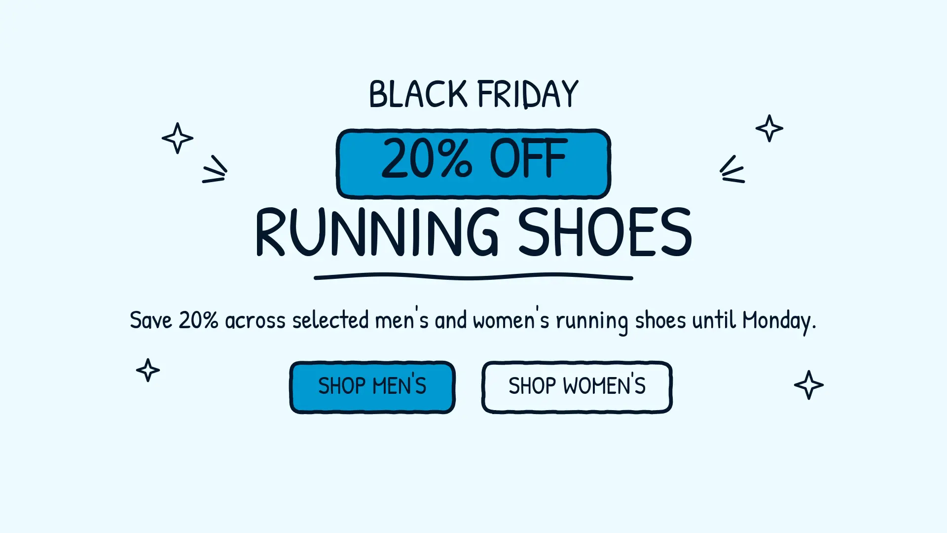
Then get them into the products.
That doesn't mean the page has to be stripped of personality. You can still use your campaign creative and brand. Just don't use so much of it that the customer has to scroll past the campaign before they can shop the campaign.
The first screen should confirm the reason they clicked and make the next action obvious.
Showing the offer without burying the products
The offer needs to be prominent, but it shouldn’t take over the page.
If somebody already clicked an ad telling them about your Black Friday promotion, you don't need to spend half the landing page convincing them that you're running a Black Friday promotion. They already know.
Tell them what the deal is and start showing them what they can buy.
If you’ve got a small range, that could mean moving quickly into individual products.
For a larger range, it might mean starting with your most important categories or bestselling products and then providing a route into the full sale. The products still need to do their normal job.
Customers still want to understand what they're buying. They still care about reviews, delivery, returns, availability and why one product is better suited to them than another. A discount doesn't remove any of that.
The offer gives somebody a reason to buy now, but the product still needs to give them a reason to buy.
That's an important distinction when briefing the page. Don't ask the designer to make the discount bigger and bigger until it becomes the entire proposition. Ask how quickly somebody can get from understanding the offer to seeing something they might actually want to buy.
Navigation, filtering and getting to the deal
The more products you're putting into the sale, the more important it becomes to help customers narrow them down.
Putting 300 discounted products onto one page technically gives customers access to everything.
It’s not going to make any of it easy to find. Think about how customers normally shop your range. If they shop by category, make the categories prominent. If size is important, make it easy to filter by size. If you sell across men, women and children, give customers an immediate way to choose. If price is a major consideration, price filters may be useful.
You might also have genuinely useful promotional routes such as Under £50, Biggest savings or Gifts under £25.
The important thing is not to add filters for the sake of having filters. Every option should make it quicker for somebody to reduce a large range into a manageable number of relevant products.
There's a very simple way to check this without any specialist software. Pick three or four products in the sale and ask somebody who wasn't involved in building the page to find them. Watch what they do.
If they're repeatedly scrolling, opening the wrong categories, struggling with filters or going back to Google or your main navigation to find the product, you've found something worth fixing.
A customer shouldn't need to understand how your website is organised to find the deal they came for.
Mobile first, because most of the traffic is
Your Black Friday page might look great when it's presented in a design review on a large screen. That's not the experience your users will have.
For many ecommerce businesses, most of the traffic will be on mobile devices, so start with the phone.
Look at the actual page and go through it as a customer would.
Can you understand the offer without scrolling?
Can you get into the products easily?
Can you use the navigation and filters with your thumb?
Are product names, images, prices and savings clear?
Do banners or pop-ups get in the way?
Can you select variants and add something to your basket easily?
Then keep going. Go from the landing page to a product. Add it to your basket. Open the basket. Start the checkout. Apply any promotional code required. Select delivery. Get as far through the payment process as you reasonably can.
Do it on more than one phone if you can. Android users might get a different experience to an Apple user that you won't pick up if you only test on one device.
When you’ve been spending weeks planning your sales page and BFCM promotion, you know where everything is and how it should work. Your users won’t have that knowledge when they land on the site. Get somebody who hasn't spent the last month working on the campaign to look at it as well.
You don't need a testing platform or a statistics background to identify obvious problems with a buying journey. You just need to experience the journey you're about to pay thousands of pounds to send customers through.
Don't approve the Black Friday landing page because it looks finished. Approve it when buying from it feels easy.
03
5 conversion blockers that cost you sales
Conversion problems can sound small when they're described as percentages.
A checkout change that costs you 0.2 percentage points of conversion rate doesn't sound particularly dramatic. Neither does a product page that converts slightly worse than it should.
But at £5m+ turnover, small amounts of friction don't stay small. If an ecommerce business generates £5m a year, every 1% of revenue is £50,000.
During peak, when you're sending more people through the website and often paying more to acquire them, the cost of those blockers can become even more significant.
So rather than looking at conversion problems as UX issues, put a value against them.
How much money is this making it harder for the business to generate?
To make the cost tangible, we'll use a £5m ecommerce business throughout. Assume it currently generates £5m at a 2% conversion rate and £100 average order value. That means roughly 2.5 million visits and 50,000 orders a year.
The five blockers below are the ones we've seen repeatedly get in the way.
1. Too Much Information
It might seem logical that the more information you give a user, the easier it will be to help them make an informed decision, but that’s not always the case.
A product page can contain everything a customer could possibly want to know and still make buying unnecessarily difficult.
Long descriptions, specs, delivery information, size guides, promotional messaging and multiple competing calls to action can leave the customer trying to work out what's actually important.
The answer isn't necessarily to remove useful information. It's to establish a hierarchy.
Put the information most likely to help somebody make the buying decision where they need it. Make additional detail available without requiring everybody to work through it before they can buy.
Benefits can be summarised. Technical detail can sit further down the page or inside expandable sections. The primary action needs to be obvious.
What could it cost?
If unnecessary complexity reduced conversion from 2% to 1.9%, the same 2.5 million visitors would generate 47,500 orders instead of 50,000. That's 2,500 fewer orders, or £250,000 in lost revenue.
2% to 1.9% sounds like nothing, but these are the margins where growth is lost.
2. Weak (or Overloaded) Trust Signals
Somebody can want your product and still not be sufficiently confident to buy it from you.
Can I return it?
When will it arrive?
Is this company legitimate?
Is the product actually as good as it looks?
What happens if something goes wrong?
Reviews, ratings, delivery information, returns policies, guarantees and secure-payment messaging can all help answer those questions.
But throwing all of them onto the page isn't necessarily the answer either.
Ten trust badges, repeated review widgets and constant reassurance can create more clutter without addressing the particular concern preventing somebody from buying.
Think about where confidence is most likely to break down and whether you are actually addressing these concerns with your trust signals.
If delivery is the concern, make delivery information obvious near the buying decision.
If customers need reassurance about quality, bring reviews closer to the product.
If returns are a common objection, don't make somebody search the footer to discover whether they can send something back.
What could it cost?
If uncertainty around delivery, returns or product quality meant just 2% of those 50,000 orders were lost, that's 1,000 orders. At £100 each, that's £100,000 in revenue.
That doesn't mean adding a review widget automatically creates £100,000. It means seemingly small points of uncertainty become commercially significant when they're multiplied across hundreds of thousands of visits.
3. Urgency Misuse
Black Friday already comes with urgency built in. Customers know the promotion ends. Stock can genuinely run out. Christmas delivery deadlines are approaching.
You don't necessarily need to manufacture more urgency.
Multiple countdown timers, flashing banners and questionable stock warnings can create pressure without helping somebody make a better buying decision. Instead, use urgency to communicate something genuinely useful.
Sale ends Monday.
Order by 18 December for Christmas delivery.
12 remaining in this size.
Those messages help somebody understand why delaying the decision could matter. The distinction is simple, “Good urgency communicates a genuine reason to act. Bad urgency invents one.”
What could it cost?
Urgency can increase immediate orders while still creating costs elsewhere.
Suppose a £5m retailer has an average order value of £100. That's approximately 50,000 orders.
If overly aggressive promotional tactics contributed to just an additional 1% of customers cancelling or returning their order, that's 500 orders.
At £100 each, that's £50,000 of revenue immediately at risk, before you account for fulfilment, payment, return-processing or reacquisition costs.
That's why judging urgency purely by whether it increased the initial conversion rate can give you the wrong answer.
4. Jargon-Heavy Copy
Customers shouldn't need to translate your product page into language they understand before they can decide whether to buy.
Brands can naturally describe products using the language they use internally with technical specifications, product terminology, manufacturing features and category jargon.
However, the customer is usually trying to answer something much simpler.
What does this do for me?
Technical information can still matter. But explain the consequence of the feature rather than assuming somebody understands why the specification is valuable.
If you’re selling a raincoat, don't tell me it’s got a waterproof rating up to 10,000mm. Explain whether that will keep me dry in a light shower or if it’s suitable in torrential rain.
Don't just list the dimensions of a sofa. Help me understand whether it'll fit into the kind of space I’m buying it for.
Clarity reduces the amount of work required to make the decision.
What could it cost?
If unclear product information meant just 1% of those 50,000 orders were lost, that's 500 orders. At £100 each, that's £50,000 in revenue.
The copy doesn't have to be catastrophically bad to cost meaningful money. It only has to make enough customers hesitate, misunderstand the product or decide to look elsewhere.
5. Emotional Disconnect
A customer isn't always buying the physical product you're showing them.
At Christmas, somebody buying a children's toy might be thinking about the reaction when it's opened.
Someone buying jewellery might be thinking about the person they're giving it to.
Someone buying a last-minute gift might simply want the reassurance that it'll arrive on time and won't look like a last-minute gift.
Your page still needs the practical information required to make the purchase, but the way the product is presented should reflect the reason somebody actually wants it.
That doesn't mean covering the website in snowflakes. It means understanding the job the product is doing for the customer and communicating it.
What could it cost?
This is harder to isolate than something like checkout abandonment because you're measuring the effect of the overall proposition rather than a single broken element.
But the commercial maths is the same. If stronger product positioning moved conversion from 2% to 2.1%, that's a 5% increase in orders from the same traffic.
On £5m of otherwise equivalent revenue, that’s another £250,000.
You don't need to claim that changing the imagery or copy will suddenly generate £250,000. The point is that at this scale, small movements have large commercial consequences.
Working out what each blocker costs you
You don't need sophisticated CRO software to start putting a value against conversion problems.
Take the amount of revenue passing through the journey you're looking at and model what happens if conversion changes.
For example, if a page receives 100,000 visitors, has a 2% conversion rate and a £100 average order value:
100,000 × 2% × £100 = £200,000 revenue
At 1.9%:
100,000 × 1.9% × £100 = £190,000 revenue
That apparently tiny 0.1 percentage-point difference is worth £10,000 across those visitors.
At 2.2%:
100,000 × 2.2% × £100 = £220,000 revenue
Now the difference is £20,000 without acquiring another visitor.
You won't know that every difference in conversion is caused by one particular blocker without properly testing it. You also shouldn’t pretend that every improvement you make will produce the uplift you've modelled.
That's not what the exercise is for. It's there to change the question from:
“Is this worth fixing?” to “If this is costing us even 0.1 percentage points of conversion, what is that worth?”
At £5m+ turnover, you don't need a dramatic conversion problem for the answer to be a lot of money.
04
Fixing the friction before you spend on traffic
There is little value in paying for more traffic if the website is making it unnecessarily difficult for that traffic to buy.
During Black Friday, that becomes more expensive. You're potentially increasing media spend at the same time as more customers are moving through the site, which means existing weaknesses are being exposed to more people.
A slow page. A checkout that doesn't work properly on mobile. An unexpected delivery charge. A payment option that fails.
Individually, they can look like website issues. Commercially, they're places where money you've already spent acquiring the customer stops turning into revenue.
Before increasing traffic, make sure the basic journey can handle it.
Site speed under peak load
A website being fast on a standard day of the week doesn't necessarily tell you how it'll perform when traffic increases significantly.
Black Friday puts more pressure on the whole setup. More visitors are loading pages, searching products, using filters, adding items to baskets and trying to check out.
The question isn't simply whether your homepage loads quickly. It's whether the buying journey remains usable when the site is busy.
Work through the pages that matter:
Landing page → category → product → basket → checkout
Look for heavy imagery, unnecessary scripts, third-party tools and anything else slowing those pages down. Speak to whoever manages your website or hosting about the traffic you're expecting and whether there are obvious capacity concerns.
You don't need to become a web developer to brief this properly.
Ask: “If traffic is materially higher than normal, what is most likely to slow down or fail?”
Importantly, don't leave that conversation until Black Friday week. You won’t be the only one and it’s an easy task to get ticked off early doors.
Mobile experience
Mobile optimisation isn't just whether the website technically works on a phone. It's whether it's easy to buy from one.
Go through the actual journey yourself rather than relying on a desktop preview of the mobile design.
Can you navigate the sale easily?
Can you use the filters?
Are buttons large enough to use comfortably?
Can you select sizes, colours or other variants?
Can you read the product information without constantly expanding sections or zooming?
Does anything overlap?
Do pop-ups get in the way?
Then get to the checkout.
Forms that feel perfectly manageable with a keyboard can become frustrating when somebody is filling them in on a small screen.
You don't need specialist software to identify the obvious problems. Use different phones, ask people who weren't involved in building the site to try it and watch where they struggle.
The standard isn't “Does the mobile site work?” It's “How easy is it to complete the purchase on a phone?”
Checkout flow
By the time somebody reaches checkout, you've already done most of the expensive work.
You've generated the demand. Paid for the traffic. Helped them find a product. Persuaded them it's worth buying. Got them to add it to their basket. You’re so close to getting the sale, so it’s a particularly expensive place to introduce friction.
Go through the checkout from beginning to end and look for anything that creates an unnecessary decision or surprise.
Can somebody check out without creating an account?
Are you asking for information you don't actually need?
Is the total price clear?
Are delivery costs shown early enough?
Are the payment methods customers expect available?
Do promotional codes work as expected?
What happens when somebody enters something incorrectly?
Can they easily go backwards without losing what they've already entered?
Don't just test the path you plan for them to take. Try an incorrect postcode. Use an expired discount code. Try a declined payment if your setup allows safe testing. Go backwards. Change the delivery method. Remove something from the basket.
You want to know what happens when the journey doesn't go perfectly, because real customers won't follow the exact path you designed.
Trust signals
Not every abandoned purchase is caused by something being technically broken. Sometimes the customer simply isn't sufficiently confident to continue.
That becomes particularly relevant when Black Friday advertising brings new customers to the site who may have little or no previous experience of your business.
They're asking questions even if they don't consciously phrase them that way.
- When will this arrive?
- How much is delivery?
- Can I return it?
- Is this website legitimate?
- What happens if there's a problem?
The answers shouldn't require a hunt through the footer.
Make delivery information clear. Make returns easy to understand. Show reviews where they help somebody evaluate the product. Make contact details accessible. Explain guarantees or warranties where they're relevant.
Trust isn't about covering the checkout in security badges.
It's about removing the uncertainty that might otherwise stop somebody completing the purchase.
Make sure the information is consistent. A landing page promising one delivery timeframe while the checkout shows another doesn't create reassurance. It creates doubt.
Fix the expensive problems first
There will always be more you could improve. You could redesign product pages, introduce personalisation, build more sophisticated recommendations or add new functionality.
That doesn't mean those things should be the priority before peak. Start with the things capable of stopping somebody buying altogether. Usually these will be site speed, mobile usability, checkout and trust.
If you're planning to spend another £20,000 bringing customers to the website, the first question shouldn't be whether you can afford the traffic. It should be:
“How much of that £20,000 are we about to send through problems we already know exist?”
05
Urgency that works without the pressure
Black Friday already gives customers a reason to act. The offer has an end date. Products can sell out. There is already genuine urgency built into the buying decision.
The mistake is assuming you therefore need to keep adding more of it.
Countdown timers. Low-stock warnings. Flashing banners. “Someone else is viewing this.” “Selling fast.” “Offer ends soon.”
Each one is designed to make the customer act now. But there is a point where urgency stops helping somebody make a decision and starts making them question whether they're being pushed into one. That matters beyond the immediate conversion.
The objective isn't simply to get somebody through the checkout. It's to get the sale without creating regret, cancellations or damaging how they feel about the brand afterwards.
Why countdown timers stopped working
There isn't anything inherently wrong with a countdown timer. If an offer genuinely ends at midnight, a timer can communicate exactly how long somebody has left to take advantage of it. Used like that, it's information.
The problem is when the timer isn't telling the customer anything useful. If it resets when they refresh the page, reappears the following day or counts down to an offer that doesn't actually end, the urgency is artificial. The timer is no longer communicating a deadline. It's trying to create one.
Even when the deadline is genuine, adding a timer to every stage of the journey doesn't necessarily make it more effective.
Black Friday customers already know they're shopping within a promotional period. A banner telling them the sale ends Monday may be enough. They don't necessarily need a clock following them from the landing page to the product page and into the basket.
The question isn't whether a countdown timer increases urgency. It's whether the customer needs the information it's providing.
If the answer is yes, use it. If not, adding pressure for the sake of pressure is unlikely to improve the buying experience.
Scarcity you can actually substantiate
The same principle applies to scarcity. “Only 3 left” can be genuinely useful information if there are only three left. It tells somebody considering the purchase that waiting may mean losing the opportunity to buy it. Scarcity becomes harder to defend when the message is vague or impossible to substantiate.
“Selling fast.”
“Almost gone.”
“High demand.”
Those messages may create urgency, but unless they're connected to something real, you're asking the customer to trust a claim they have no way of evaluating. Instead, use the scarcity that genuinely exists.
If there are six items left in a particular size, say so.
If a product is a limited run, explain that.
If you know stock won't be replenished before Christmas, tell customers.
If the final date for guaranteed Christmas delivery is 18th December, make that deadline clear.
The distinction is fairly simple. Useful urgency tells somebody what they risk by waiting. Manufactured urgency simply tells them not to wait. One helps them make the decision. The other tries to make the decision for them.
Urgency and brand damage
This is the part that gets missed when urgency is judged purely through conversion rate. Pressure can work.
A customer who thinks an offer is about to disappear may be more likely to buy immediately. If you're measuring only completed purchases, that can look like a successful intervention.
But the customer's experience doesn't end when the payment confirmation appears.
They can cancel the order. Return it. Question whether they really wanted it. Feel frustrated when the supposedly limited offer is still available tomorrow. Become less receptive the next time you tell them something is genuinely scarce.
That is where a short-term conversion tactic can create a longer-term commercial cost.
The issue is particularly relevant during Black Friday because customers are exposed to urgency from almost every retailer they encounter. Adding more pressure doesn't necessarily differentiate you. A calmer buying experience can do more for confidence than another warning that time is running out.
That doesn't mean removing urgency altogether. It means being accurate about it.
Tell customers when the sale ends. Tell them when delivery cut-offs are approaching. Tell them when availability really is limited. Give them the information they need to understand the consequence of waiting.
Then let them make the decision. A conversion isn't particularly valuable if the way you generated it makes the customer regret buying from you.
Urgency also needs to feel genuine. If you're telling customers the sale is about to end, but they know you run promotions regularly, the urgency won't land. You'll become a brand that can only turn on the sales tap when a promotion runs, and customers will learn to wait because they know another one will come soon. Usually when you're missing your sales target.
The best urgency doesn't need to feel like urgency at all. It simply gives somebody a genuine reason to act now, without giving them a reason to distrust you afterwards.
06
Preparing your sales page for search
Black Friday happens once a year. Your Black Friday page shouldn't.
One of the most common mistakes with annual sales pages is treating them like temporary campaign collateral.
A new Black Friday page gets created. It runs for a few weeks. The sale finishes. The page disappears. Then, the following year, another one gets created.
From a search perspective, you're repeatedly starting again.
Instead, your Black Friday page should be treated as a permanent part of the website. Keep the same URL every year, allow it to build authority over time and change what the page does depending on where you are in the trading calendar.
One permanent URL, every year
Don't put the year in your Black Friday URL.
If you create /black-friday-2026/ you're immediately building an expiry date into the page.
Next year you either need to reuse a URL with the wrong year in it or create /black-friday-2027/ and start building the new page again.
Instead, use something permanent. /black-friday/
The products can change. The offer can change. The copy, metadata and creative can change, but the URL doesn't need to. That gives search engines one consistent destination and gives you one page that can accumulate links and authority rather than fragmenting them across a collection of annual campaign URLs.
Black Friday is an annual campaign. It doesn't need an annual URL.
Redirecting off-peak traffic instead of deleting the page
Keeping the page doesn't mean leaving an expired Black Friday promotion live for the next eleven months. When the campaign ends, change the purpose of the page.
If somebody finds it outside the Black Friday period, acknowledge that the promotion has finished and give them somewhere useful to go next.
That could be your current sale.
It could be discounted products.
It could be the closest relevant category.
It could give them the option to sign up to hear about the next Black Friday promotion.
The important thing is that the URL remains live and useful. Then, as the next Black Friday approaches, the page can transition back into the campaign landing page. You're not creating another page. You're updating an asset you already have.
Internal linking between guide and sale page
Your Black Friday content and your Black Friday sales page should support each other.
If you have guides, buying advice or other informational content attracting people researching Black Friday, link from those pages into the commercial page where relevant.
Then consider where the sale page can link back to useful supporting content. This helps establish the relationship between the pages, but it's also useful for the customer.
Someone searching in September might still be researching what to buy. Someone arriving on Black Friday itself may be ready to purchase.
Those are different searches, but they can be part of the same journey. The mistake is creating a collection of Black Friday pages without connecting them. Make the relationship obvious.
The September calendar reminder
Put a recurring reminder in the calendar for the beginning of September to look at the page. It doesn't require a complicated process. The value is simply forcing the conversation to happen early enough for you to do something about it.
Review the Black Friday page.
Check whether the content needs updating.
Update the page title and metadata where necessary.
Remove references to old dates and promotions.
Make sure this year's priority products and categories are represented.
Check which pages are linking to it.
Look at whether the page is appearing for the searches you'd expect.
Identify anything that needs development work.
Give search engines time to find and process the changes before the campaign is already underway.
If the first time anyone thinks about the organic search opportunity is November, you've left yourself very little room to do anything meaningful about it.
Put it in the calendar for September and make it somebody's job.
Auditing redirect chains and dead links
Reusing the same Black Friday page each year doesn't mean the rest of the site stays the same.
Products disappear.
Categories are renamed.
Old content is removed.
URLs change.
Redirects get added.
And over several years, you can end up with internal links pointing through multiple redirects or towards pages that no longer exist.
Before peak, audit the links around your Black Friday content. If one page links to an old URL which then redirects to the current page, update the original link so it points directly to the current destination.
If something links to a page that no longer exists, find the most relevant replacement. Don't automatically send everything to the homepage.
If somebody clicks a link expecting a particular product category and lands on the homepage, you've technically kept them on the website but you've still broken the journey.
The same applies to historical Black Friday URLs. If you've created separate annual pages in the past, work out where those URLs should now point and make sure you're not leaving behind a trail of competing, redirected or dead campaign pages.
Build on it, don't rebuild it
There is nothing particularly complicated about this approach. You don't need to reinvent your Black Friday SEO strategy every year.
You need one permanent sales page.
Keep it useful outside peak.
Connect it properly to the rest of your Black Friday content.
Check the links and redirects around it.
Then put a reminder in the calendar early enough to prepare it for the next campaign.
Your Black Friday page shouldn't be something you rebuild every year. It should be something you build on every year.
07
The pre-traffic checklist
By the time Black Friday traffic starts arriving, the important work on the website should already be done.
You don't want to discover that the offer isn't clear after the campaign launches. That the products you're advertising are difficult to find. That the checkout doesn't work properly on mobile. Or that your tracking isn't recording purchases correctly.
Before you start pushing more traffic through the site, work through four areas.
Commercial
Start with what you're actually asking the page to sell. A Black Friday page can look good and function perfectly while still doing a poor job of connecting the traffic you're buying with the products you actually want customers to buy.
- Is the offer on the page the same one customers are seeing in your advertising?
- Is it immediately clear which products are included in the promotion?
- Are the products you most want to sell easy to find?
- Are your priority products given enough prominence?
- Are different campaigns being sent to the most relevant destination rather than everything being routed through one generic Black Friday page?
- Are you promoting products more heavily than the available stock can support?
- Do you know what happens when a featured product sells out?
- Can somebody easily continue shopping if the featured products aren't right for them?
Think about the journey from the advert onwards. If somebody clicks an advert for 20% off running shoes, they shouldn't arrive on a generic Black Friday page and have to find the running shoes themselves.
The page should connect the reason somebody clicked with the products you want them to buy.
Page and content
Now look at how easy you've made that purchase. Open the page on a phone and approach it as though you've just arrived from one of your campaigns.
- Can you understand the offer without scrolling?
- Is the next action obvious?
- Can you get to the relevant products quickly?
- Can you navigate and filter the range easily?
- Is important product information easy to understand?
- Are delivery and returns clear?
- Are reviews and other trust signals positioned where they're useful?
- Is any urgency genuine and based on something you can substantiate?
- Are pop-ups, banners or promotional messages getting in the way?
- Does the page still make sense to somebody who knows nothing about the campaign?
Then give the phone to somebody who hasn't spent the last month working on the campaign and ask them to buy something.
Don't explain the page to them and ask them to talk you through what they do.
Technical
Next, make sure the journey actually works. Don't limit this to checking that the Black Friday landing page loads. Follow the full route a customer might take: Landing page → category → product → basket → checkout → payment
- Are the important pages loading quickly?
- Has whoever manages the website or hosting considered the additional peak traffic?
- Do filters and product variants work properly?
- Are the correct prices and discounts being applied?
- Do promotional codes work?
- Can somebody check out without creating an account?
- Are the payment methods working?
- What happens when somebody enters something incorrectly?
- Can customers move backwards without losing what they've already entered?
- Are there broken links?
- Are important pages going through unnecessary redirect chains?
- Have you tested the journey on different mobile devices?
Don't just test the journey you expect customers to take. Use an expired promotional code. Enter an incorrect postcode. Change the delivery option. Go backwards. Remove something from the basket. Try a failed payment if your setup allows you to test it safely.
Try to find the problems before your customers do.
Measurement
Finally, make sure you'll know what people actually do once the traffic arrives.
This doesn't need to become a complicated measurement project. At this stage, you're checking that the basic information you'll need to understand website performance is available and reliable.
- Are purchases being tracked correctly?
- Is revenue being recorded correctly?
- Are key actions such as add to basket and checkout being captured?
- Can you see landing-page performance?
- Can you see which products and categories people buy?
- Can you distinguish between desktop and mobile performance?
- Can you see where people are dropping out of the journey?
- Are your advertising platforms receiving the conversion signals they need?
- Have you checked that tracking still works after any changes made to the Black Friday pages or checkout?
Don't assume tracking works because it worked last month. Place a test order. Check that it appears where you expect it to. Check the revenue value. Check the journey.
There is a much bigger question around how you determine whether Black Friday actually created incremental growth and commercial value. That's covered in the Black Friday Measurement Guide.
Here, the objective is simpler, make sure you can trust what the website tells you happened.
Before you turn the traffic on
None of this requires a sophisticated CRO programme. You need to know that you're sending customers towards the right products, that buying from the site is straightforward, that the journey works and that you'll be able to see what happened.
Because once the campaign is live, every problem you've left in the journey gets exposed to more people and you're paying for the privilege.
08
Make more from the traffic you're already paying for
You can spend weeks improving campaigns, reducing acquisition costs and finding ways to bring more people to the website. It’s often overlooked that the media team's job effectively stops at the click. What happens next often sits somewhere between marketing, ecommerce, development and CRO, without anybody really owning the whole journey. That's where seemingly small problems with landing pages, navigation, mobile experience and checkout turn paid traffic into wasted spend.
The bigger point is that wasted marketing spend isn't just money being spent on the wrong campaigns. It's also money spent acquiring traffic that the rest of the journey fails to convert effectively. We typically find 15-30% in wasted marketing spend in the first 3 months of working with a brand.
Our Growth Intelligence Audit is designed to find it. We look beyond the ad platforms and connect your marketing performance with what happens after the click to identify where you're losing customers you've already paid to acquire, where the journey is constraining performance and where the biggest opportunities to generate more from your existing traffic sit.
That's exactly what we found with The Great Caravan, Motorhome & Holiday Home Show. Rather than simply sending more traffic to the existing ticket page, we replaced it with a purpose-built landing page designed around the campaign and the buying journey.
Conversion rate increased by 109%.
The opportunity wasn't more traffic. It was getting significantly more value from the traffic they already had.
Read The Great Caravan, Motorhome & Holiday Home Show case study
If you want to understand how much of your existing marketing investment is being lost after the click and what you can do about it, start with a Growth Intelligence Audit.
Stopped growing online?
We know how to fix that.
We start with your data, not your channels.
Commercial, market, performance, customer and behavioural data, woven into one view rather than five separate reports.
It shows where your profit comes from, which activities earn their place, which are dead weight, and what's worth doing next.
We typically find 15-30% in wasted marketing spend in the first 3 months.
Channels are the tools; making your business more money is the objective.
Latest News
See all
Black Friday Strategy Guide
Record Black Friday revenue can still leave you with less profit. A guide to planning peak around margin, stock and the whole trading period.


Black Friday Ads Guide
Spending more over Black Friday isn't the only way to grow. How to reallocate budget, structure Meta and Google, and plan creative for peak.
Black Friday Landing Page Guide
More Black Friday traffic won't fix a leaky journey. Fix your landing page, mobile experience and checkout before you spend more on clicks.