
Why Educational Landing Pages Outperform Product Pages for Conversion

Most brands assume poor ads kill conversions. The real issue sits on the page where visitors land. Many product pages demand too much thinking. They show features and specs, then expect shoppers to work out the reason to buy. This forces people to judge the product with little guidance.
Educational landing pages work differently. They teach, guide, and give shoppers the confidence to act. They show why the product matters, why it solves a real problem, and why it is worth the investment. This turns passive browsing into active intent.
In this post, we break down why product pages underperform, what educational landing pages do with greater skill, and how these pages boost conversion without spending more on traffic.
Product Pages Are the Lazy Sales Assistant
This expectation is the core problem. When the page lacks a guided explanation, the visitor must work to understand why the product matters and how it solves their problem.
Many product pages avoid addressing common fears that matter to real customers. Shipping, fit, maintenance, reliability, and quality remain unclear. These small uncertainties create hesitation, which in turn leads to drop-offs.
A better model is to think of a skilled store assistant. They ask the right questions, explain how the product works in simple terms, and demonstrate how it fits the shopper’s needs.
A strong landing page behaves like this assistant, not like a shelf that waits silently for the shopper to figure everything out.
Educational Landing Pages Turn Browsers into Buyers
If you want customers to act with confidence, you give them your best sales assistant. This is the mindset behind an educational landing page.
1. They Educate Before They Sell
An effective educational landing page removes doubt by answering four essential questions.
- What is the product? Many pages skip the basics. They jump straight into features and technical terms. A simple definition helps visitors who are unfamiliar with the solution.
- How will it benefit me? People act when they understand outcomes. They want speed, comfort, savings, predictability, or fewer frustrations.
- Why does it exist? When the page explains the problem that led to the product’s creation, it signals that the brand understands the visitor’s reality.
- Why is it right for me? Visitors look for personal relevance. Educational pages show short scenarios, use cases, or comparisons that help visitors recognise themselves.
This shift from selling to teaching aligns with how people make decisions. When the mind understands something clearly, it commits with less effort and less hesitation.
2. They Match Information to Intent
Landing pages perform best when they match the visitor’s level of awareness and the source of the traffic. Each source carries different expectations, so the page must adjust what it shows first and how it explains value.
Visitors from social ads often have low awareness. They did not search for the product. They simply saw an ad while browsing. These visitors need:
- A simple explanation of the problem
- A short story or relatable scenario
- Clear reasons the product matters in their daily life
- A visual that shows the product in context, not in isolation
For example, a home cleaning product promoted on Facebook will convert better if the landing page starts with a familiar pain point, such as stubborn stains that take too long to remove. Showing the product in action with a quick before-and-after gives visitors a reason to care more than a list of ingredients or performance claims.
Visitors from search ads usually have higher intent. They are actively looking for a solution. They need:
- Clear value statements
- Direct answers to common questions
- Comparison points that help them evaluate the product
- Evidence such as reviews, ratings, or key metrics
If someone searches “best noise-cancelling headphones for online meetings”, they are already solution-aware. The landing page should lead with proof and relevance, not a long introductory story.
Educational landing pages respect these differences. They show low-awareness visitors why the product matters and give high-intent visitors the fast clarity they came for.
3. They Remove Doubt and Build Confidence
Doubt creates friction, and friction slows the decision. Educational landing pages remove this hesitation by addressing the exact fears and questions that usually cause drop-offs.
Use clear, practical elements that guide decisions:
- Benefit-led visuals that show real-use scenarios: Visitors trust what they can see. A simple before-and-after, or a short clip showing the product in context, reduces the mental load of imagining how it works.
- FAQs are placed where hesitation naturally occurs: For example, place shipping and return FAQs near the price, or sizing questions near the product selector. Location matters as much as the answer.
- Short testimonials or star ratings positioned early: People look for quick reassurance. A few lines of social proof near the top of the page can prevent early exits.
- A clean, step-by-step buying or sign-up path: When visitors know what happens next, they are more willing to commit. Clear steps outperform long, unpredictable flows.
If people often worry about sizing, a simple sizing guide or a “fit guarantee” placed above the fold can significantly reduce hesitation. If the concern is quality, a short video demo or a material breakdown placed near the main image can reinforce trust.
Educational landing pages work because they make the decision feel safe. They reduce the mental effort required to understand, compare, and commit.
The Science Behind Why Education Converts
A major driver of conversion is cognitive load. When the brain has to work too hard, it looks for the easiest escape. A cluttered layout or unclear value forces the visitor to slow down.
Educational content reduces that load. It takes the mental work off the visitor by explaining the product in a logical sequence.
- It starts with the problem, so the visitor knows why the product exists.
- It shows the product in real scenarios, so the value feels concrete.
- It introduces benefits before features, so shoppers understand the outcome.
- It answers questions in the order they naturally appear in the shopper’s mind.
This makes the page easier to process. People are more likely to take action when the path is simple and the meaning is clear.
Data support this approach. A general study concludes that well-written, accurate product information can increase conversion by up to 78% by reducing the effort required for interpretation.
We see the same effect in our client's optimisation tests. When we improved price clarity and removed vague cost references, the page achieved a 48% lift. When we added a simple explanation of total savings and showed how the numbers work, the page delivered an 81% increase in conversions. None of these gains came from bigger discounts or higher ad spend. They came from making the value easier to understand.
This is the core advantage of educational landing pages. People process information with less effort and move forward with greater confidence.
What Makes Landing Pages Different and Better
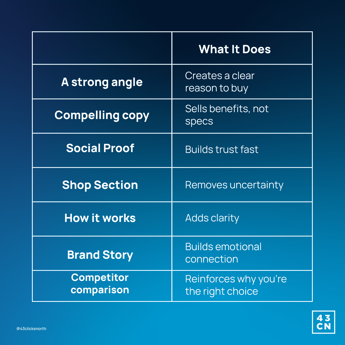
An educational landing page reduces hesitation by providing shoppers with the information they need to make a confident decision. In the webinar, we break down the 7 Ingredients Framework, a structure that shows how top-performing pages teach just enough before they sell.
Below is a brief snapshot of the seven ingredients and the role each one plays.
Individually, each ingredient answers a question shoppers carry with them. Together, they form a narrative that moves a visitor from curiosity to conviction.
When a page can teach, anticipate objections, and position the product within a clear choice architecture, it stops behaving like a sales asset and starts functioning like a decision-making tool.
Why This Matters for E-Commerce and SaaS
Educational landing pages matter because most online product experiences are built for exploration, not decision-making.
In e-commerce, many product detail pages read like digital catalogues. They offer choices but little interpretation. Shoppers are left to piece together the problem, the value, and the expected outcome on their own. An educational landing page shapes a narrative and gives the visitor a reason to move forward.
SaaS pages often mirror the same issue. Feature lists replace clarity. Benefits appear without context. Visitors are expected to already understand the problem they’re trying to solve. A well-structured educational page addresses this by guiding users through a clear progression: the problem they feel, the solution you offer, and the outcome they can expect.
Educational landing pages surface that reason with precision. As one guiding principle puts it, “A product is only as good as the reason to buy.” They organise confusing details into a clear message, making it easier for visitors to trust the product and decide to buy.
Real Progress: The Results Show What Works
Stone Refurb improved their landing pages with small content and UX adjustments when we shifted our strategy from product listing to education.
Here are the highlights:
- +48% lift after improving price clarity.
- +81% lift after showing total savings in a simple, practical way.
- +15% lift after adjusting the placement of the main call to action.
By structuring the page to educate, each element reduces friction, answers questions, and highlights value at the right moment. This approach turns clicks into confident decisions, showing that a well-designed post-click experience makes each visitor more likely to convert than on a traditional product page.
Key Takeaways
Shoppers don’t want more options. They want to understand what they’re buying. Educational landing pages give them the context they need. They explain the product, show proof it works, and highlight the value, so people can decide without overthinking.
When a page educates, it builds trust. When shoppers trust, they act.
Instead of feeling lost in a list of features or choices, visitors feel guided. Confidence grows, decisions become easier, and conversion happens more naturally.
The real power of an educational landing page is that it turns understanding into action.
Stopped growing online?
We know how to fix that.
We start with your data, not your channels.
Commercial, market, performance, customer and behavioural data, woven into one view rather than five separate reports.
It shows where your profit comes from, which activities earn their place, which are dead weight, and what's worth doing next.
We typically find 15-30% in wasted marketing spend in the first 3 months.
Channels are the tools; making your business more money is the objective.
Latest News
See all
5 Conversion Blockers That Hurt Black Friday Sales
Shoppers are ready to buy this season, but site blockers can send them to competitors. Discover 5 mistakes to avoid and how to fix them.


5 Strategies to Boost Ecommerce Landing Page Conversions
Your ecommerce landing page is critical in the success of your online store. Join 43 Clicks North as we share our tips on boosting your conversion rates.

How building/nurturing communities can benefit your brand
One of the most enigmatic marketing strategies, has always been communities. Find out how building & nurturing communities can benefit your brand with 43CN.