When to Use Interactive or Static Elements on Landing Pages

Your landing page performance depends on how clearly you present information and how easily someone can take action. Interactive and static elements shape that experience.
Landing pages with improved UX design can perform up to four times better, which shows how much impact the right structure and layout can have on your conversions.
The challenge is knowing when to use each type of element. You may have pages where visitors are ready to act and need a clear, focused path. Other pages require more explanation, where interaction helps them understand your offer and move forward with confidence.
This guide shows you how to use interactive and static elements based on shopper intent, product complexity, and user behaviour, so your landing page supports faster decisions and clearer next steps.
Interactive vs Static Design Elements
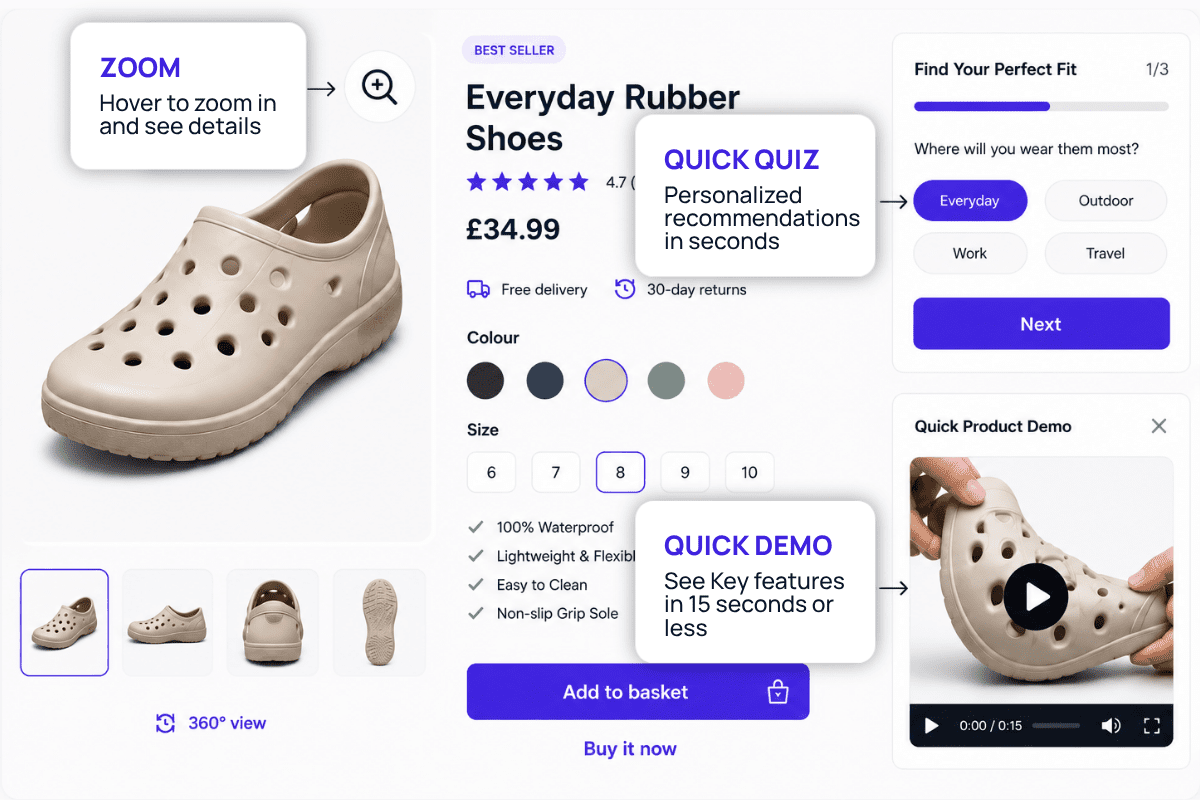
Interactive elements are parts of a landing page that respond when users take action, such as clicking, hovering, or entering information. Common examples include sliders, product demos, chatbots, quizzes, and animated graphics.
A special note on calculators: they can work well for pricing pages, but they often don’t deliver strong conversion results. According to our CRO Specialist, Dave Walker, this is a classic example of instant gratification bias.
People prefer immediate reward, but calculators ask users to invest effort before seeing a benefit.
The psychological contract is violated because the work precedes the reward, and using a site shouldn't feel like work. Interactive elements should engage visitors quickly, without wasting their time.
Static elements, on the other hand, are fixed visuals or text that do not change through user action. They include headlines, images, icons, and call-to-action buttons that remain constant.
These elements can be used on their own or combined, depending on the type of SaaS product you offer.

Matching Your Design to Shopper Intent and Buying Stage
Think about what your shoppers need to know first and what step you want them to take next. Every landing page sits within a journey, and that journey shapes how your design should behave.
Some visitors already understand the product, its value, and what they’re looking for. They’re ready to purchase. In this case, a static layout supports a fast process. Clear headlines, strong product imagery, visible pricing, and a direct call-to-action keep attention focused on completing the purchase, as shown in the headphone example above.
Other visitors arrive in discovery mode, and we call them the browsing shoppers. They may be comparing products, exploring categories, or trying to understand how a product fits into their needs. This type of shopper benefits from guided interaction. Elements such as product previews, variant selectors, or quick-view features help them explore without friction.
What breaks the experience:
- Combining high-intent and browsing layouts on a single page. This slows decision-making. Use a simple layout with a fixed CTA for purchase pages, and use interactive modules only on browsing-focused pages.
- Adding extra interactions for ready-to-buy shoppers. You should remove sliders, tabs, or pop-ups near the CTA and keep one clear button above the fold.
- Place pricing, product details, or the call-to-action behind clicks or animations. Show price, key specs, and the CTA immediately.
Shopper intent also connects to how much time they plan to spend on the page. High-intent buyers often act within seconds. Adding extra motion or layered interactions can interrupt that momentum.
Your audience profile adds another layer. Tech-comfortable shoppers, frequent online buyers, and category-aware customers are familiar with interactive patterns and expect to engage with the page. General consumers or first-time buyers look for clarity upfront. They want to see what the product is, how much it costs, and what to do next without extra steps.
Mapping these behaviours gives direction to your layout. When the goal is immediate action, keep the experience direct and focused. When the goal is understanding and exploration, build in interaction that supports how shoppers move through information.
Using Interactive Elements to Explain and Not Delay Decisions
These elements play a strong role when shoppers need more clarity before making a decision. Many visitors land on a page without fully understanding how a product works, what options are available, or which variation fits their needs. Static text and images can only go so far in explaining these details.
A special note on using calculators as an interactive element: They can work well for pricing or bundle pages, but they often don’t deliver strong conversion results. According to our CRO specialist, this is a classic example of instant gratification bias.

The psychological contract is violated when work precedes reward, and using a site shouldn't feel like work. Interactive elements should engage visitors quickly, without wasting their time.
What to use instead:
- Pre-filled pricing examples: Show a default bundle or configuration with total price already calculated. Let shoppers adjust quantities or options from there.
- Toggle-based comparisons: Use simple switches like monthly vs yearly pricing, or basic vs premium, where results update instantly with one click.
- Progressive reveal panels: Show key details upfront, then expand only when needed, such as specs, inclusions, or savings breakdown.
These elements keep interaction lightweight and focused on clarity. Pricing and product detail sections are common friction points. When shoppers move back and forth between sections or exit on these pages, uncertainty is present. Interactive previews, toggles, or guided selections help clarify choices and reduce hesitation.
Interactivity should always support faster understanding. Problems arise when these elements are hidden behind unclear labels, require multiple steps to show value, or interrupt the page's natural flow. Every interaction should lead quickly to a clearer decision.
Keep Static Elements Clear for Speed and Conversions
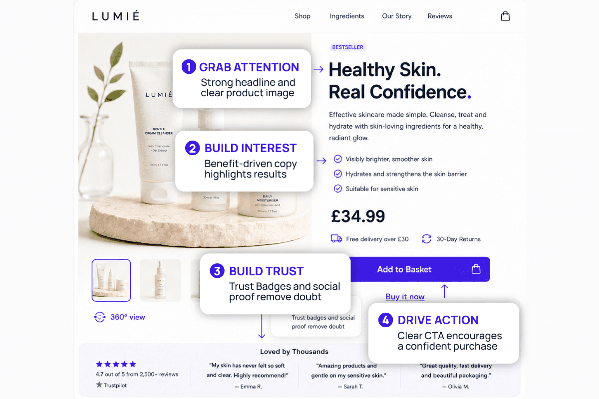
Static elements are fixed visuals or text that do not change through user action. This includes product titles, images, pricing, benefit-driven copy, trust badges, and call-to-action buttons that remain visible and consistent. The example below shows how these elements work together to create a clear and focused path to purchase.
A strong hero section with a clear product image, concise value proposition, and visible CTA creates a direct path to purchase. Your message should be clear and visible upfront so it does not slow the decision process.
Where static layouts go wrong and what to do:
- Hiding the CTA below the fold or blending it into the design. You should keep the CTA visible immediately with strong contrast and fixed positioning if needed.
- Cluttering the layout with excessive badges, icons, or text blocks. Keep only the most relevant proof points near the CTA, such as key benefits or one trust signal.
- Using long, dense paragraphs in key decision areas. Break content into short lines, bullet points, or quick-scan sections near the product details.
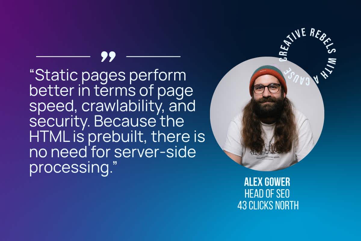
Another reason to favour static designs is performance. Large animations or complex scripts can slow down page speed, which affects user experience and even SEO. As our SEO expert notes.
You should use compressed images, web-safe fonts, and minimal scripts so content loads quickly. This will result in faster-loading pages, which can increase conversion by up to 8.4% and contribute to stronger search performance.
Early-stage awareness shoppers benefit from static design as they want to understand the product, why it matters, and what to do next. Clean layouts, readable typography, and focused visuals communicate this without distraction.
Help users understand the complexity of your product
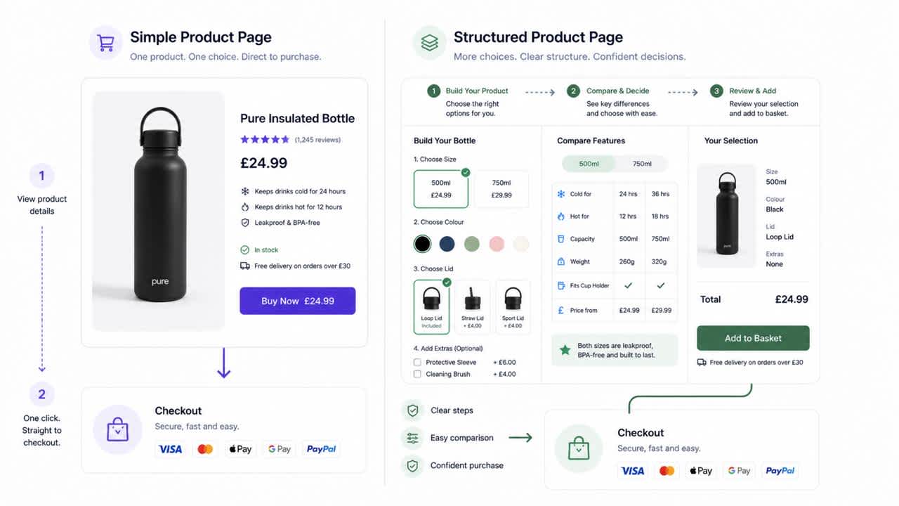
In e-commerce, this can include configurable products, multi-step purchases, or items where shoppers need to compare features before deciding. Interactive elements such as product builders, comparison toggles, or guided selection tools help simplify these decisions and make the experience easier to follow.
How to handle complex products without friction:
- Do not show all options at once, as this overwhelms shoppers. Break configurations into steps like “Select size → Choose add-ons → Review,” with one decision per step.
- Keep comparisons in one place so shoppers don’t switch between pages. Use side-by-side layouts or inline toggles within the same view.
- Structure customisation is clearly achieved by grouping inputs under sections like “Size,” “Features,” and “Add-ons.” Add a progress indicator so shoppers know where they are.
- Show price changes instantly as options are selected. Keep the updated total visible near the call-to-action at all times.
For simpler products, the same level of interaction is not always necessary. Items with a single variation or a clear use case can communicate value through a structured static layout. A strong product image, short description, visible pricing, and a clear call-to-action often provide enough information for shoppers to move forward.
You can identify the right approach by looking at how much explanation your product requires before a purchase happens. If shoppers frequently revisit product details, compare options repeatedly, or contact support with basic questions, it signals that more guided interaction could improve clarity.
If most shoppers understand the product within seconds and proceed directly to checkout, a clean and focused static layout supports that behaviour more effectively.
Measuring the impact of your different elements
The choice between interactive and static elements becomes clearer when you look at how shoppers behave on your page. Data shows where friction exists, where attention drops, and where decisions happen.
Scroll Depth and Click Activity
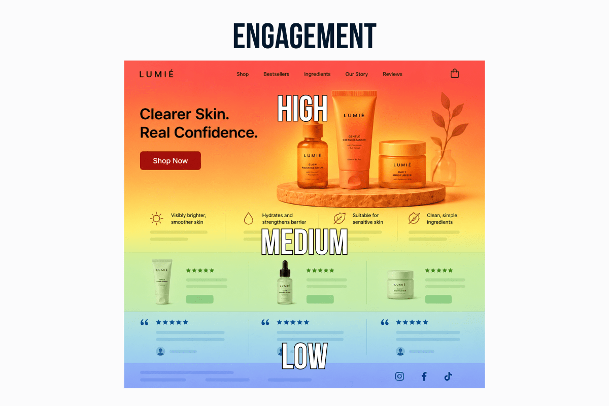
Use tools like Hotjar or Microsoft Clarity to review how people scroll and click. If shoppers move through long sections without interacting, the content is likely not helping them decide.
Trim those sections, pull out the key benefits into short bullet points, and add a visual or product highlight to make the message easier to grasp. If pricing, product details, or the CTA get little attention, bring them higher on the page and repeat them after key sections so they stay visible.
Session Recordings for Deeper Insight
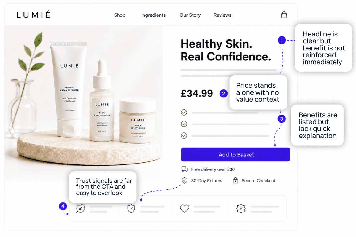
Tools like FullStory help you spot hesitation. Long pauses or repeated cursor movement often mean something is unclear. Add a short explanation, label, or tooltip right in that section to answer the question immediately.
If shoppers keep jumping between sections, place related details like pricing, features, and benefits closer together so they can compare without extra effort.
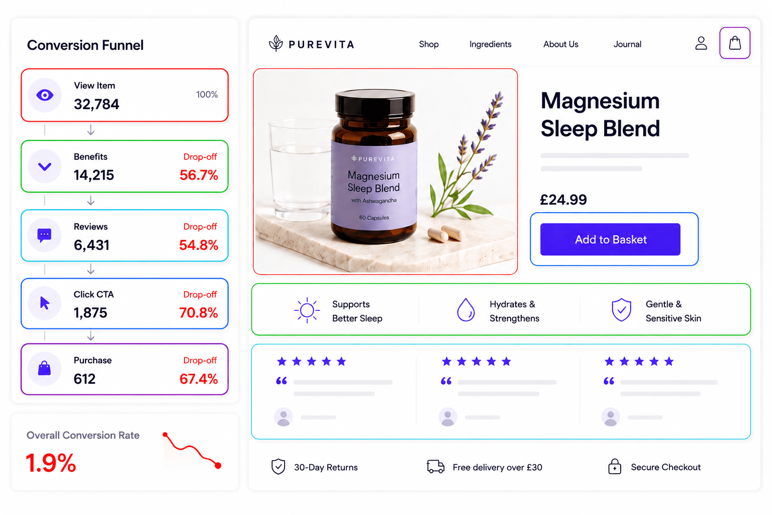
Conversion Data for Revealing Patterns
Use Google Analytics or Google Analytics 4 to see where people drop off. If high-intent traffic is not converting, the page may not be guiding them clearly. Bring key benefits higher, simplify the flow, and make the next step obvious. If people leave before reaching the CTA, reduce the content above it, surface the most important details earlier, and add trust signals like reviews or guarantees near the CTA to support the decision.
Data should lead to specific changes. Move important elements higher when they are missed, simplify sections where hesitation appears, and introduce interaction only where it helps shoppers reach a decision faster.
This is how you improve your landing page so shoppers understand faster and move through it with less friction.
How the Right Design Choices Turn Traffic into Conversions
Stone Refurb, a brand that refurbishes and sells computers, saw measurable improvements in landing page performance after applying CRO and UX strategies developed by our team. The changes led to:
- 48% increase in conversion after emphasising the price through a cleaner, more structured static layout that made cost information instantly understandable.
- 81% increase in conversion by adding an interactive savings toggle that helped users compare options without effort.
- 15% increase in conversion from moving the primary CTA above the fold, giving visitors a clear next step the moment they land.
Each improvement came from understanding how people moved through the page. We analysed real user behaviour to identify where attention dropped, what caused hesitation, and which elements supported decision-making.
This proves that using the right design elements in the right context can directly influence how people decide and act on a page.
Make Your Landing Page Easier to Understand and Act On!
The way you structure interactive and static elements shapes how quickly someone understands your offer and moves towards a decision. When your layout reflects shopper intent, reduces effort, and keeps key information visible, the page becomes easier to process and act on.
The strongest landing pages are not built on trends or features, but on how clearly they guide attention, remove friction, and support decision-making at each stage of the journey.
Working with an expert in this field helps ensure your landing page is designed with that level of clarity and consistency. At 43 Clicks North, we create landing pages that balance clarity and interaction to support faster decisions.
Stopped growing online?
We know how to fix that.
We start with your data, not your channels.
Commercial, market, performance, customer and behavioural data, woven into one view rather than five separate reports.
It shows where your profit comes from, which activities earn their place, which are dead weight, and what's worth doing next.
We typically find 15-30% in wasted marketing spend in the first 3 months.
Channels are the tools; making your business more money is the objective.
Latest News
See all
5 Conversion Blockers That Hurt Black Friday Sales
Shoppers are ready to buy this season, but site blockers can send them to competitors. Discover 5 mistakes to avoid and how to fix them.


5 Strategies to Boost Ecommerce Landing Page Conversions
Your ecommerce landing page is critical in the success of your online store. Join 43 Clicks North as we share our tips on boosting your conversion rates.

How building/nurturing communities can benefit your brand
One of the most enigmatic marketing strategies, has always been communities. Find out how building & nurturing communities can benefit your brand with 43CN.