
The Psychology Behind Consumer Decision-Making Post-Click

Every marketer works hard to earn a click. It takes strong creative, persuasive copy, and a clear message. When someone taps your ad, it feels like progress. Yet the real work starts the moment they land on your page. That post-click moment is when expectations form, and quick judgments determine whether someone stays or leaves.
The data makes this clear. E-commerce and marketplace pages show a median bounce rate of 38.61%, and SaaS pages sit even higher at 48.27%. Anything close to 60% usually signals that the page is not answering questions or building confidence fast enough.
If your page does not establish trust and relevance immediately, visitors exit without engaging. Bounce rate reflects this behaviour clearly: people stay only when the page earns attention within seconds.
In this post, you’ll see what customers think and feel right after clicking an ad, how those reactions shape decisions, and how to design landing pages that keep visitors engaged instead of losing them.
The Post-Click Mindset and Why Shoppers Are Not Ready to Buy Yet
A landing page must give visitors the emotional green light to continue. Features can wait. Certainty comes first.
Those first seconds matter more than most marketers expect. Many users leave within 10–20 seconds. That’s enough time for the brain to scan the layout, tone, imagery, and headline, then decide whether the page feels aligned or not. When the value is clear, attention lasts longer.
This moment is fragile. Visitors are quietly validating whether staying is worth the effort or whether leaving is easier. When the page fails to give a strong reason to stay, hesitation sets in. That hesitation is friction.
Friction comes from small issues that stack up fast. Some examples:
- Crowded hero section: Too many elements compete for attention, making it hard for users to identify the main message within the first few seconds.
- Headline without a clear benefit: A clever or vague line forces visitors to interpret the meaning instead of instantly understanding the value.
- Ad-to-page mismatch: When the landing page fails to match what the ad promised, users feel misled and leave immediately.
- Delayed load of key content: Slow-loading headlines or hero images signal low quality and burn the crucial 10–20 second attention window.
Once the visitor senses heaviness, their patience thins. They feel it is not worth their time.
At this stage, clarity wins. Sharp content wins. A focused offer wins.
Anything confusing creates distance. The page must respect the mental state visitors bring with them. They arrive curious and open. The role of the page is to nurture that state toward confidence.
Cognitive Load: The Hidden Killer of Conversions
Cognitive load is the mental effort a visitor uses to understand a page's content. If a page requires too much processing, the visitor might disconnect. The brain will not invest energy unless it can recognise value quickly.
Most people do not read landing pages the way marketers expect them to. Research shows that 79% of users scan a new page and only 16% read it word by word. This means that if your page has too many long paragraphs or too many choices, it can trigger overload, and users may skip them entirely, missing the message.
Simplicity lowers cognitive strain and opens the path to conversion. It works when the page offers clear, specific cues, such as:
- A headline that states the core benefit in the first line.
- A hero section with one primary action instead of competing buttons.
- Short paragraphs or one-sentence blocks that can be scanned in under two seconds.
- A layout with visible spacing so the eye knows where to travel next.
- A single message per section with no blended ideas or mixed intentions.
Every second spent trying to decode the page is a second taken away from action. This delay weakens momentum and reduces the likelihood of conversion.
Landing page psychology thrives on simplicity. When a page is easy to scan, visitors can quickly understand the value and move toward taking action.
Role of Trust: The Currency of Post-Click Decisions
Trust shapes almost every decision a visitor makes. People do not purchase the product first. They purchase the belief that what they are about to do is sensible.
Trust grows through alignment and proof:
- Alignment: The first signal comes from familiarity. When the page message matches the ad message, the visitor senses they are in the right place. It lowers suspicion and encourages further reading.
- Legitimacy: Testimonials, case studies, ratings, and trusted sources create reassurance. They show that real people have used the product or service and that the brand has substance. Visitors notice patterns of positive experiences, which build confidence.
- Transparency: Clear pricing, delivery information, and guarantees reduce doubt and fear. Visitors want to know exactly what they will get and what they will have to pay.
- Social proof: A single review can help, but a structured set of proof points like multiple testimonials, logos of trusted partners, or case studies can build a stronger foundation of trust.
Product pages often behave like a lazy shop assistant: they list features and wait for the visitor to figure things out.
Landing pages behave like a trusted advisor: they guide the visitor with intent, remove confusion, and instill confidence.
Here are some comparisons:
- A product page lists features; a landing page explains why each feature matters and what the visitor should do next.
- A product page hides pricing or does not fully disclose the real price; a landing page displays clear, upfront costs.
- A product page offers generic testimonials; a landing page uses structured proof points with real names, photos, or company logos.
Tone also forms trust. The words on the page must feel grounded and clear. Visitors should sense that the brand understands their problem and knows the solution. For more helpful information on how to build trust, check this post.
Trust is the currency that powers commitment, and every element on your landing page should signal trust. This helps your target audience decide and convert smoothly.
5 Emotional Triggers That Drive Action
People often sense the right choice before they consciously reason through it. These emotional triggers are natural responses built into the way people think and make decisions.
1. See the Offer in an Instant
Clarity is the foundation of all other emotional triggers. Anyone who wants to understand the product or service immediately, without effort.
A headline like “Get Your Website Live in 24 Hours” communicates exactly what is offered and what the outcome is. In contrast, a headline that says “Revolutionise Your Online Presence” lacks the direct information needed by a curious customer.
When clarity is present, they immediately decide whether the product or SaaS is exactly what they need, and this instant understanding makes them continue, explore the page, and move closer to taking action.
2. Make Visitors Feel Certain
Confidence grows through showing awards, testimonials, guarantees, or customer success stories.
For instance, a testimonial with a name, photo, and specific result gives tangible reason to believe in the product. If testimonials are anonymous or generic statements like “Everyone loves our product” are used, people will doubt them.
Structural elements also contribute. A polished layout, consistent spacing, and fast load times signal attention to detail. Visitors judge the brand as competent or careless in seconds, and this quick assessment influences whether they feel safe enough to continue reading and trust the information presented.
3. Remove Doubt Before It Starts
A potential customer always carries small doubts about price, outcomes, and the risk of making a mistake. A short FAQ, a clear returns policy, or a simple line that explains what happens after purchase can dissolve this tension and create a sense of safety.
A message such as “Free 30-day returns if you are not satisfied” gives them permission to move forward without fear of financial loss. It signals that the brand is confident in its offer and willing to take the risk off the shopper’s shoulders.
Reassurance can also come from showing how support works. A page that explains response times, communication channels, or setup assistance demonstrates a commitment to the customer’s experience.
People need to know they will have help if something goes wrong, and this knowledge strengthens buying confidence.
4. Speak Directly to Your Ideal Customer
When a page speaks directly to a specific persona, it tells the visitor that the product was designed with their situation in mind.
A line such as “Created for small business owners who want to save time on website setup” offers clarity and relevance. It shows who the product serves and why it matters to them.
A generic claim such as “Our solution fits everyone” may weaken that emotional link. They cannot see their own problems reflected in the wording, so they feel less connected to the offer. A landing page that tries to speak to all audiences ends up creating a message that feels flat, and this reduces engagement.
5. Show the Outcome They Will Achieve
Clear rewards help visitors move through decisions quickly because they can feel the payoff ahead of time. They sense a genuine improvement that makes the action worthwhile.
For example, a benefits list such as “Double your leads in 30 days using our automation tool” gives a concrete goal, a clear timeline, and a measurable improvement. The visitor can picture the impact on their work and understand the payoff in simple terms.
A line such as “Grow your business quickly” has the opposite effect. It feels empty because the promise lacks scale and context. People do not want to guess what the improvement looks like. They want to see the result before they commit.
Reward becomes stronger when the page shows how the outcome fits into the visitor’s life. If the offer saves time, show the actual hours they can reclaim each week. When a reward is tied to real scenarios, it becomes easier to trust and easier to pursue.
A page designed with these five triggers guides visitors in a way that matches their thought process and needs, and makes conversion an effortless step in the journey.
The Science of Why Education Converts
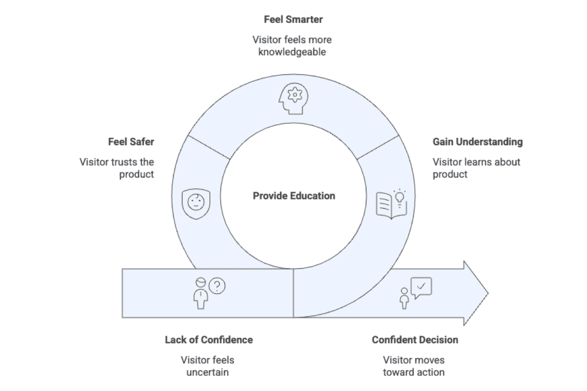
Education creates a loop of confidence. The visitor gains understanding, then feels smarter, then feels safer, and finally moves toward action. Research in digital marketplaces shows that when people learn about a product and its context, their trust rises, and that trust strongly predicts purchase intention and commitment.
When shoppers understand why a product exists, they feel aligned with it. They see the problem it solves, recognise the gap in their life, and gain clarity on the benefit. Once that clarity forms, the decision starts to feel natural.
Our client data reflects this pattern. Landing pages that focused on benefits rather than technical details increased conversions by up to 81%. This improvement came from a clearer explanation, not visual design alone.
We also observed that removing friction points, such as vague calls to action, increased conversion by 15-30%. These reinforce how people respond to structure and straightforward communication.
People want to feel informed before they commit. A brand that teaches rather than pushes, it builds respect and credibility. Educational pages become the mechanism that turns interest into confident action.

Why This Matters for E-Commerce and SaaS
Educational landing pages matter because most online product experiences are built for exploration, not decision-making.
In e-commerce, many product detail pages read like digital catalogues. They offer choices but little interpretation. Shoppers are left to piece together the problem, the value, and the expected outcome on their own. An educational landing page shapes a narrative and gives the visitor a reason to move forward.
Educational landing pages surface that reason with precision. As one guiding principle puts it, “A product is only as good as the reason to buy.” They organise confusing details into a clear message, making it easier for visitors to trust the product and decide to buy.
How to Build Pages That Align with Human Decision-Making
Now that we understand the mindset, the load, and the triggers, we can shape landing pages that work with human behaviour instead of against it.
Step 1: Match Message to Intent
Confirm what the visitor expected. Continue the same promise. Complete the thought they clicked for.
A click creates momentum. The page must catch that momentum cleanly. If an ad focuses on price, the page must surface the price or the savings within the first moments. If an ad promotes speed or simplicity, the hero section must reinforce that value without delay. This removes early friction and prevents the visitor from questioning whether they landed in the right place.
A Google ad promotes “Save 40% today”. The landing page opens with a headline that repeats the savings and shows the price without requiring a scroll. This creates a direct mental link between the expectation and the experience.
Message alignment lowers cognitive dissonance. The brain feels more stable once the environment reflects the expectation that triggered the click.
Step 2: Design for Focus
One story. One goal. One CTA.
Visitors follow a single mental track. A page that introduces multiple topics forces the brain to choose its own path. That choice increases cognitive work and slows decisions.
For example, a SaaS tool that promotes fast onboarding. Some brand pages introduce onboarding, pricing, integrations, testimonials, and product philosophy in the hero. A focused page introduces only the onboarding benefit, then guides visitors through proof and the primary CTA. Everything else sits later in the flow or not at all.
Focus reduces decision fatigue. The mind relaxes once it no longer has to negotiate multiple options. This insightful article can help you better understand how to address cognitive load and unspoken fears on your website.
Step 3: Show Proof Early
Make proof visible, recognisable, and relevant within the first scroll.
Proof needs to reach the eye fast. This can be a rating, a client logo, a testimonial snippet, or a trusted badge. The form does not matter. The position matters.
A hero section includes a clear CTA followed by a Trustpilot score and the number of verified reviews. The visitor sees the action and the reassurance in the same sweep of attention.
Step 4: Guide Emotion from Start to Finish
Recognise the problem. Present the solution and invite action with confidence.
Start by showing that the core problem is understood. Then introduce the solution clearly. Support it with proof and a visible reward. Close with a CTA that signals confidence rather than pressure.
A good example is a project management SaaS that opens with a short line about the stress of scattered tasks. It follows with a simple statement that the platform brings all tasks and conversations into one organised space. A testimonial highlights how a team reduced meeting time by 40%. A short benefits block reinforces the reward. The section ends with a CTA that feels decisive and calm.
Guided emotion helps visitors feel psychologically safe. When they understand the offer and see it presented clearly, the page itself becomes the best salesperson. It leads them naturally toward a decision.
Key Takeaway
Post-click optimisation draws its power from understanding human behaviour. A page that respects the visitor's mind earns trust and action.
Landing pages that perform well remove unnecessary thinking. They build trust through proof and tone. They create clarity through structure and message. That is the real advantage of well-crafted post-click optimisation work.
It meets customers at the exact moment of uncertainty and guides them toward confidence and action.
Stopped growing online?
We know how to fix that.
We start with your data, not your channels.
Commercial, market, performance, customer and behavioural data, woven into one view rather than five separate reports.
It shows where your profit comes from, which activities earn their place, which are dead weight, and what's worth doing next.
We typically find 15-30% in wasted marketing spend in the first 3 months.
Channels are the tools; making your business more money is the objective.
Latest News
See all
5 Conversion Blockers That Hurt Black Friday Sales
Shoppers are ready to buy this season, but site blockers can send them to competitors. Discover 5 mistakes to avoid and how to fix them.


5 Strategies to Boost Ecommerce Landing Page Conversions
Your ecommerce landing page is critical in the success of your online store. Join 43 Clicks North as we share our tips on boosting your conversion rates.

How building/nurturing communities can benefit your brand
One of the most enigmatic marketing strategies, has always been communities. Find out how building & nurturing communities can benefit your brand with 43CN.