
The essentials for online forms


How an online form is laid out has had a lot of debate over the years. With many claiming the perfect number of fields to ensure conversion. But the truth of the matter is that there is no magic number of fields. It is entirely contextual to what you need and want the form to do.
So instead of talking about the number of fields. I instead wanted to highlight some essential functionality that every form should have – regardless of context.
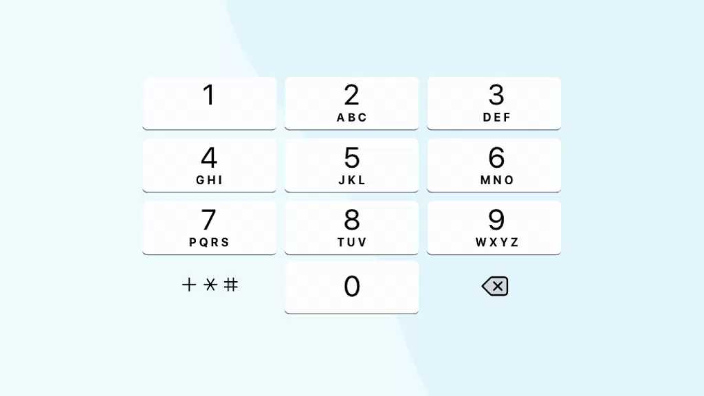
Number keyboards
Most forms require some number entry, usually phone numbers so having an easy way to enter numbers is crucial right?!
Unfortunately, too many forms out there are still making users switch from the text keyboard to a number keyboard on mobile phones. While this doesn’t sound like the biggest hassle in the world. It is one small thing that can make the filling out of a form significantly easier.
This is simple to do from a development point of view and is just lazy if overlooked.
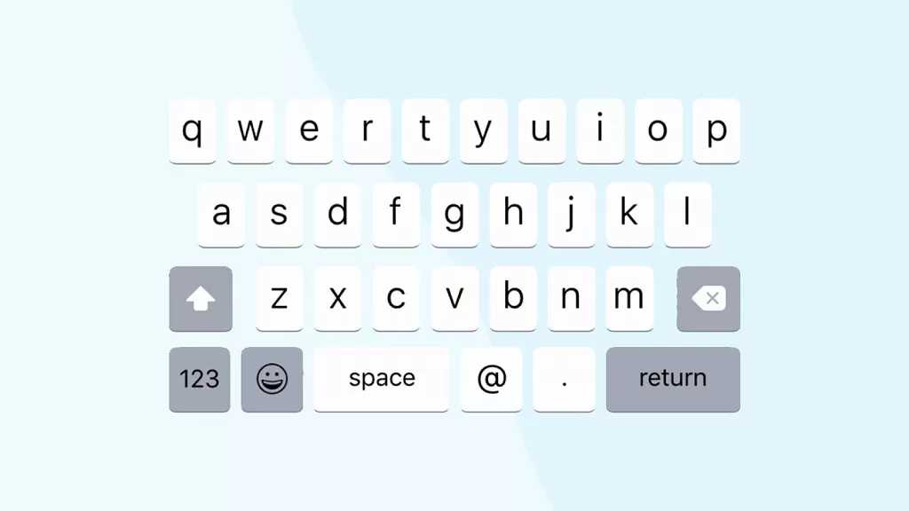
@ sign
On the same theme as number keyboards. The @ sign is required for anyone entering an email address. So again, why do so many forms require you to switch keyboards.
It is simple enough to create a keyboard for your users that has this on as standard. Again, stopping them from having to switch between several keyboards while filling it out.
Although we cannot stop someone from having so many unusual characters that they have to do this regardless… di@bol!callyCh&ll£nged@gmail.com im looking at you!
Field Labels
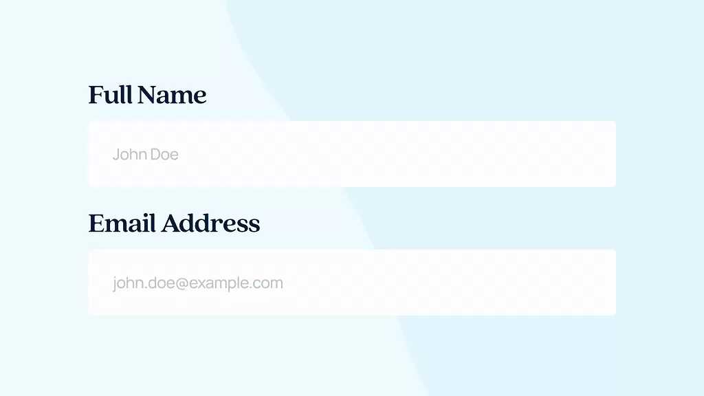
It's obvious that any form will have entry fields, so it makes sense to have labels for these as well. We are not talking about the heading that says Full or Second Name. I am talking about within the field itself.
This adds further clarification to what is needed. We strongly recommend adding in some placeholder text as standard. For example, underneath the email you can have example@example.co.uk.
Secondly if they do get stuck there is help ready and waiting for them. Reducing the chance of them abandoning the form, saying they will try again later, but never actually returning.
Error messages
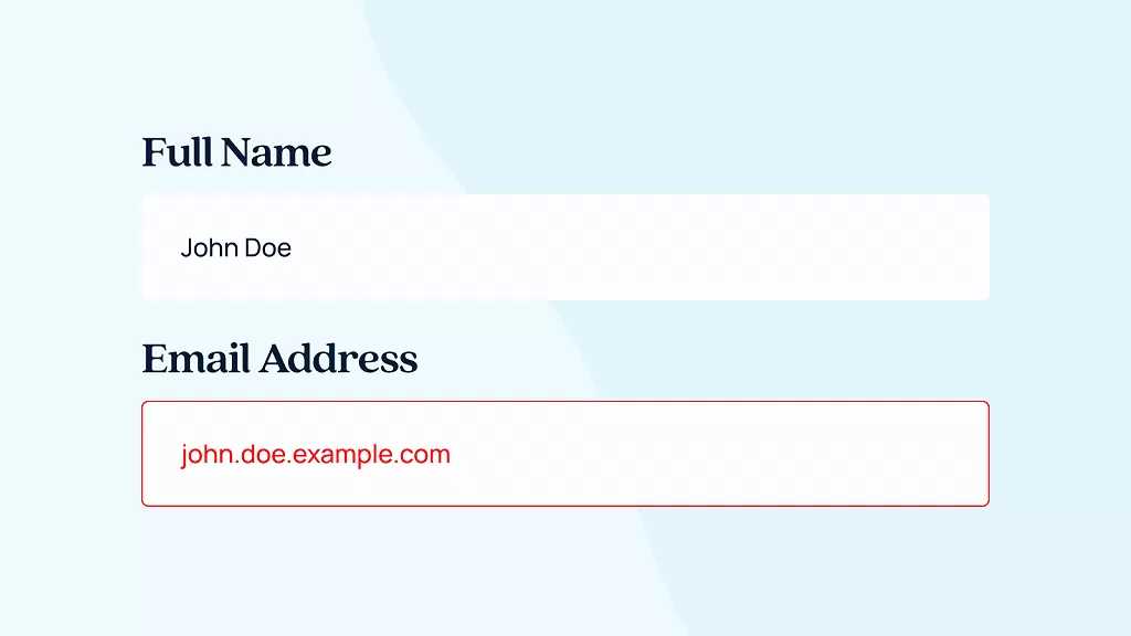
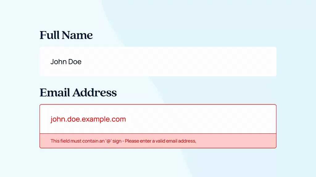
Sometimes to make sure the users give you the right information to service them properly you need to create mandatory fields with certain criteria. A simple one for example is that the email must contain the “@” symbol.
In this instance a form can be validated before submission, telling the user there is an error. Great, but what’s the error?
Not telling the user what is wrong is a horrendous crime. They have filled out the form, as per your instructions and not all you give them is “computer says no...”
If the form errors due to a user entering the wrong information you need to tell them why and how to fix it. This gets more complicated for forms where a lot of different information is needed such as insurance companies. But for basic websites this can be as simple as… ”your email address must contain an “@” symbol”.
By not offering this help you are asking your users to go and try elsewhere.
A Clear CTA
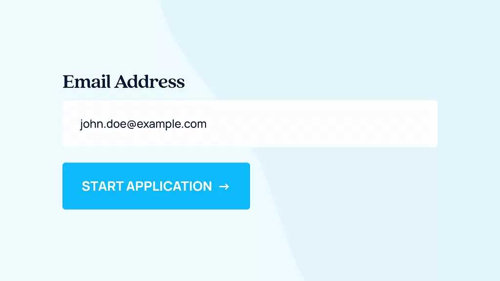
Finally, the end of a form should clearly inform the user of what they are doing. Having a simple “Submit” CTA is not going to gut it. What are they submitting to, are they submitting to you?
Within even touching on the negative connotation associated with “submitting” there are thousands of other appropriate CTAs to use. While it all depends on content below are just a few that can be used. Hopefully you will be able to figure out where they need to be used.
Within even touching on the negative connotation associated with “submitting” there are thousands of other appropriate CTAs to use. While it all depends on content below are just a few that can be used. Hopefully you will be able to figure out where they need to be used.
- Final Step >
- Complete Transaction >
- Enter Shipping Details >
- Start Application >
- Send Application >
- Apply Now >
- Request a Call Back >
Think about what the user's next step is. The CTA should properly reflect that to set expectations. Imagine clicking a button that says, “buy now” and not actually buying it and being asked for more details? You know who you are?!
Stopped growing online?
We know how to fix that.
We start with your data, not your channels.
Commercial, market, performance, customer and behavioural data, woven into one view rather than five separate reports.
It shows where your profit comes from, which activities earn their place, which are dead weight, and what's worth doing next.
We typically find 15-30% in wasted marketing spend in the first 3 months.
Channels are the tools; making your business more money is the objective.
Latest News
See all
5 Conversion Blockers That Hurt Black Friday Sales
Shoppers are ready to buy this season, but site blockers can send them to competitors. Discover 5 mistakes to avoid and how to fix them.


5 Strategies to Boost Ecommerce Landing Page Conversions
Your ecommerce landing page is critical in the success of your online store. Join 43 Clicks North as we share our tips on boosting your conversion rates.

How building/nurturing communities can benefit your brand
One of the most enigmatic marketing strategies, has always been communities. Find out how building & nurturing communities can benefit your brand with 43CN.