
Landing Page Conversion Elements: Design That Drives Sales


A landing page lives or dies on one outcome. Visitors must feel confident enough to take action. Everything else is secondary. Design does not exist to impress or entertain. It exists to direct attention, reduce doubt, and make the next step feel safe.
Most landing pages fail for predictable reasons. They show too much at once. Important signals compete for attention. Decisions feel harder than they should. People scan, compare, and seek reassurance before committing. A strong landing page works with that behaviour, not against it.
This article breaks down the conversion elements that directly affect sign-ups, including pricing tables, calls to action, social proof, trust signals such as awards and compliance badges, and integration logos. We will explain not only what good execution looks like but also why it matters and how to apply it in practice.
Pricing Tables: Simplify Plan Choices
Pricing is the point where interest turns into evaluation. At this point, visitors begin asking more challenging questions. Is this worth it? Do I need this plan? Am I about to choose the wrong option? A strong pricing table reduces the effort required to answer those questions.
Good pricing design simplifies the decision. This is achieved through visual hierarchy, clear differentiation, and restraint. When pricing tables are well-structured, people understand the value more quickly and feel more confident selecting a plan.
Learn from Basecamp’s Pricing Layout
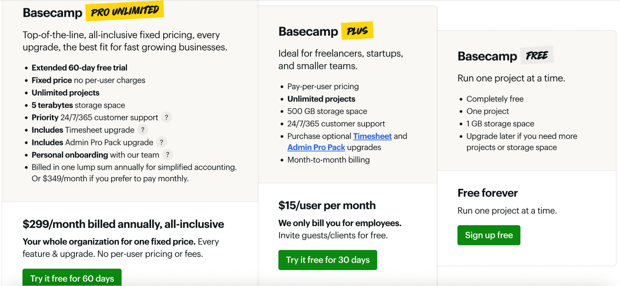
Basecamp offers a strong example of a well-designed pricing table. The section features a limited number of plans, with a clear emphasis on the Pro Unlimited option. That plan is given more visual weight through scale and position. The eye is guided naturally.
The pattern is simple and repeatable:
- One visually dominant plan acts as a safe default.
- No “best value” labels or discount framing.
- A single price anchor.
What makes this layout effective is as much about restraint as emphasis. Typography remains consistent across plans. Feature lists align perfectly. This allows side-by-side comparison without strain.
A common bad habit is treating every feature as equally important. Teams add icons, background colours, labels, and highlights to nearly every row. When everything is emphasised, nothing stands out. Users lose clarity, and decisions stall.
Technical Tips For Pricing Layouts
Export pricing graphics at 96 PPI for standard web clarity or 144 PPI for premium display and sharper typography. Maintain consistent font sizing across all plans so users don’t have to adjust their eyes when comparing features.
Use contrast to highlight differences, but stay within your colour palette to avoid visual fatigue. And leave enough white space around each column to make comparisons effortless.
Where Brands Often Go Wrong
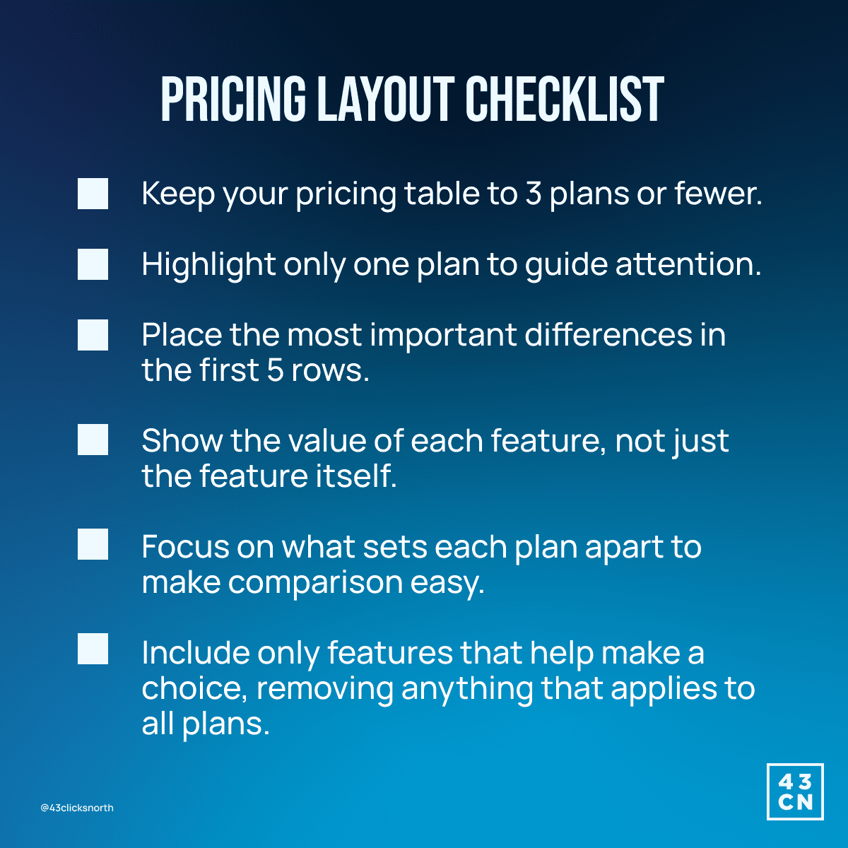
Pricing tables tend to underperform when:
- There are too many plans.
- More than one plan is visually highlighted.
- Differences between plans are buried deep in the list.
- Features are listed without explaining their value.
If a visitor cannot explain the difference between plans in five seconds, the pricing table has failed.
What Brands Should Do Instead
- Limit the pricing table to three plans. More than that slows comparison.
- Highlight only one plan. Never highlight two.
- Show the most important differences in the first five rows.
- Remove features that apply to every plan. They add noise without helping the choice.
An effective pricing table recognises that people value reassurance more than persuasion. Consistency across layout, spacing, and labelling removes the need to re-interpret each plan.
Our goal is not to push users into a choice, but to make the right choice feel obvious and safe.
Calls to Action: Guide Users Forward
Calls to action are where intention turns into behaviour. A CTA should feel like the natural next step. If the page has done its job, the button does not convince. It confirms.
At this stage, potential users want to proceed without risk or confusion. CTA design and wording must reflect that mindset.

Learn from Grammarly’s CTA Pattern
Grammarly demonstrates balanced CTA design with a primary button that stands out through a restrained layout rather than through aggressive language.
The same wording is repeated throughout the page, using friendly, conversational phrasing instead of transactional terms, and often includes immediate reassurance, such as “It’s free.” This consistency removes the need for users to re-interpret intent and helps each repetition build confidence and forward momentum.
CTAs fail when designers try to be clever. Buttons should look clickable at a glance. Shape, colour, and spacing must signal action instantly. The surrounding content should support the CTA, not compete with it.
Secondary actions should exist only when necessary and should never visually compete with the primary CTA. If two buttons look equally important, neither will perform well.
Technical Tips For CTA Buttons
CTA assets must remain sharp and readable at all sizes. Export at 144 PPI to preserve clean edges. Use colour contrast that clearly separates the button from its background without breaking brand consistency.
Include short, action-oriented labels, like Grammarly's, that are unique and effective. One consistent phrase across the site is more effective than several variations.
Where Brands Often Go Wrong
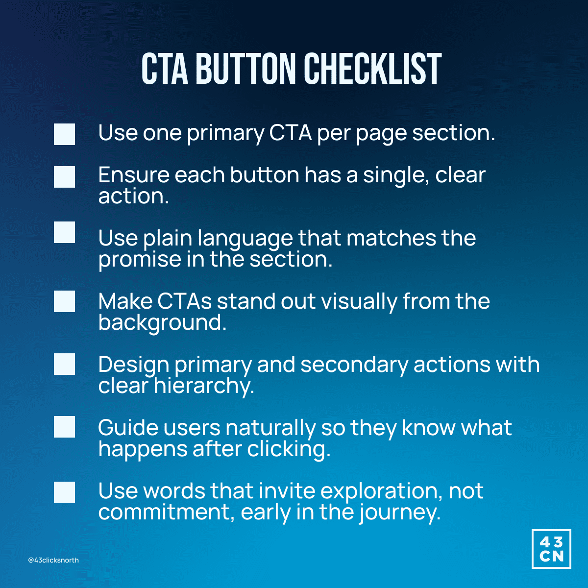
CTAs typically underperform when:
- Buttons blend into the background. For example, when they share the same colour as decorative elements or links, users scan past them instead of recognising them as the next step.
- Multiple CTAs use different messages, such as pairing “Start free trial” with “Talk to sales” in the same section, which forces users to pause and reconcile their intentions.
- Labels are vague or abstract, like “Learn more” or “Click here,” which give no clear signal about what happens after the click.
- Primary and secondary actions look equally important. For instance, when both buttons are the same size, colour, and weight, they lose their sense of direction.
A user should never need to pause to decide which button to click. A well-designed CTA will naturally lead them to take action without hesitation. It reassures the user that moving forward is safe, expected, and sensible.
What Brands Need to Do
- One primary CTA per page section.
- One action per button. No combined actions. For example, “Book a demo” rather than “Book a demo and get pricing.”
- Use plain language that mirrors the promise already made, like following a section about faster workflows with a CTA that says, “See the workflow in action.
- Remove words that introduce effort or commitment too early, for instance, replacing “Sign up now” with “Explore the platform” or “Take a quick look.”
The CTA should match the user’s level of certainty.
If the page is educational, invite them to explore further.
If the page is solution-focused, ask them to see it in action.
Avoid resetting the journey with generic language that ignores everything they have just read. Every button should fit the context, reassure users, and gently guide them to the next step they already have in mind.
Social Proof: Build Trust Quickly
Social proof reduces perceived risk by answering the unspoken question every user has: “Has this worked for someone like me?”
When users see that real people and credible companies rely on a product, trust increases quickly because the decision no longer feels experimental.
Social proof works best when it demonstrates popularity while making the decision feel safe and socially validated.
Learn from Buffer’s Testimonial Structure
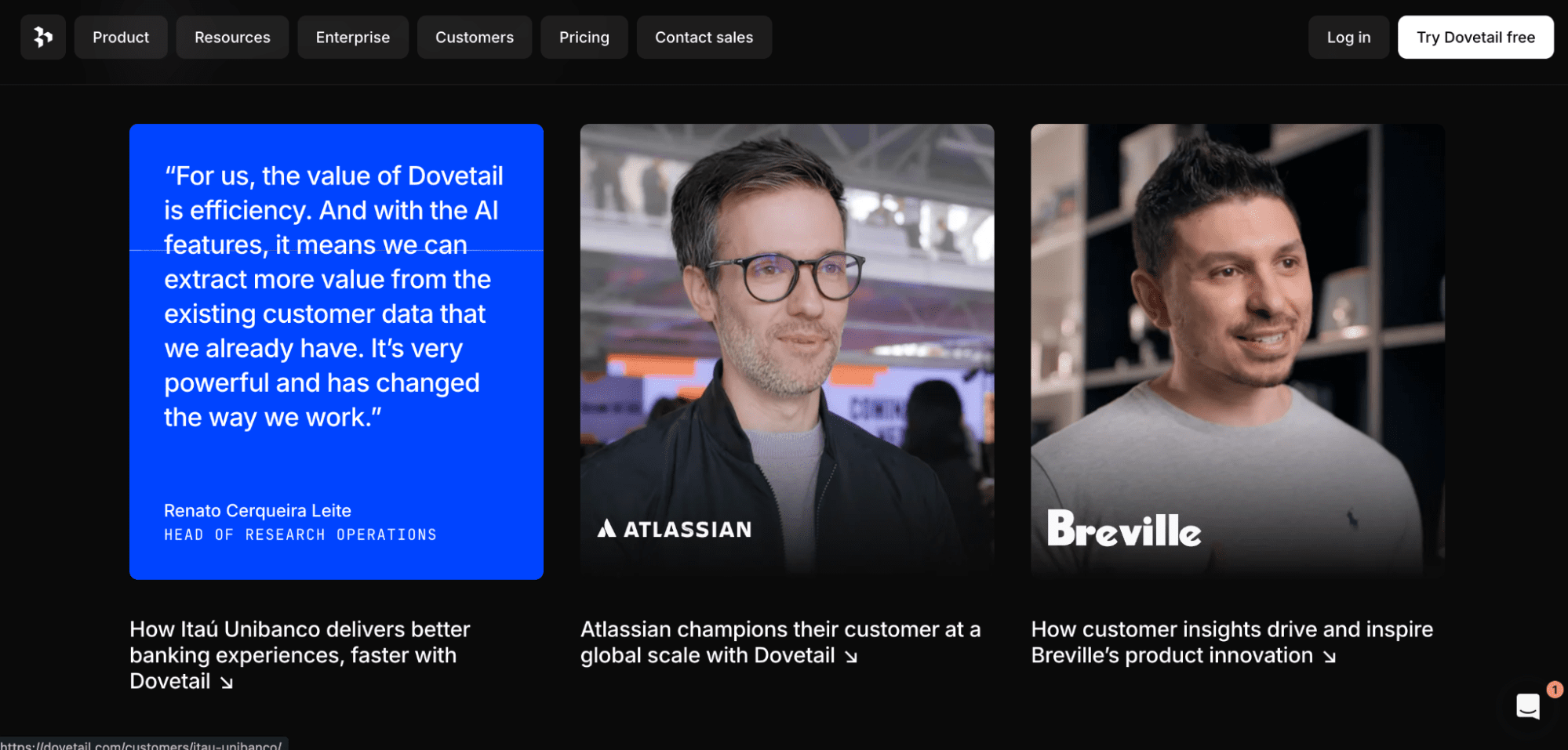
Buffer provides a strong example of structured social proof that supports the reading flow. The page opens with well-known brand logos, establishing legitimacy before any detailed claims are made. Testimonials appear later and are organised by industry, making it easier for users to recognise patterns that apply to them.
Why they succeed:
- Logos appear first to establish authority and reduce initial scepticism.
- Quotes remain short and focused on outcomes rather than opinions.
- Names, titles, and photos follow a consistent format that signals transparency.
Their structure communicates professionalism and reliability. They reinforce trust before a single word is analysed.
Testimonials perform poorly when they sound generic or overly polished. For example, a quote like “This tool is amazing and changed everything for our team” provides no context and reads as interchangeable with any product.
In contrast, a stronger testimonial might say, “We reduced support response times by 32% after switching, and our team no longer tracks tickets in spreadsheets.”
Strong testimonials reference a clear situation, problem, or improvement. Examples include:
- “We cut onboarding time from two weeks to three days.”
- “Errors dropped after we automated approvals,” or
- “This replaced a manual handover that used to break every month.”
These details help users imagine themselves achieving a similar outcome. Moreover, the best testimonials sound slightly imperfect. They reflect how people actually speak rather than how brands want them to sound.
Photos also help, but only when they are authentic. A simple team photo or lightly edited headshot builds more trust than an over-retouched portrait or a stock image that looks staged.
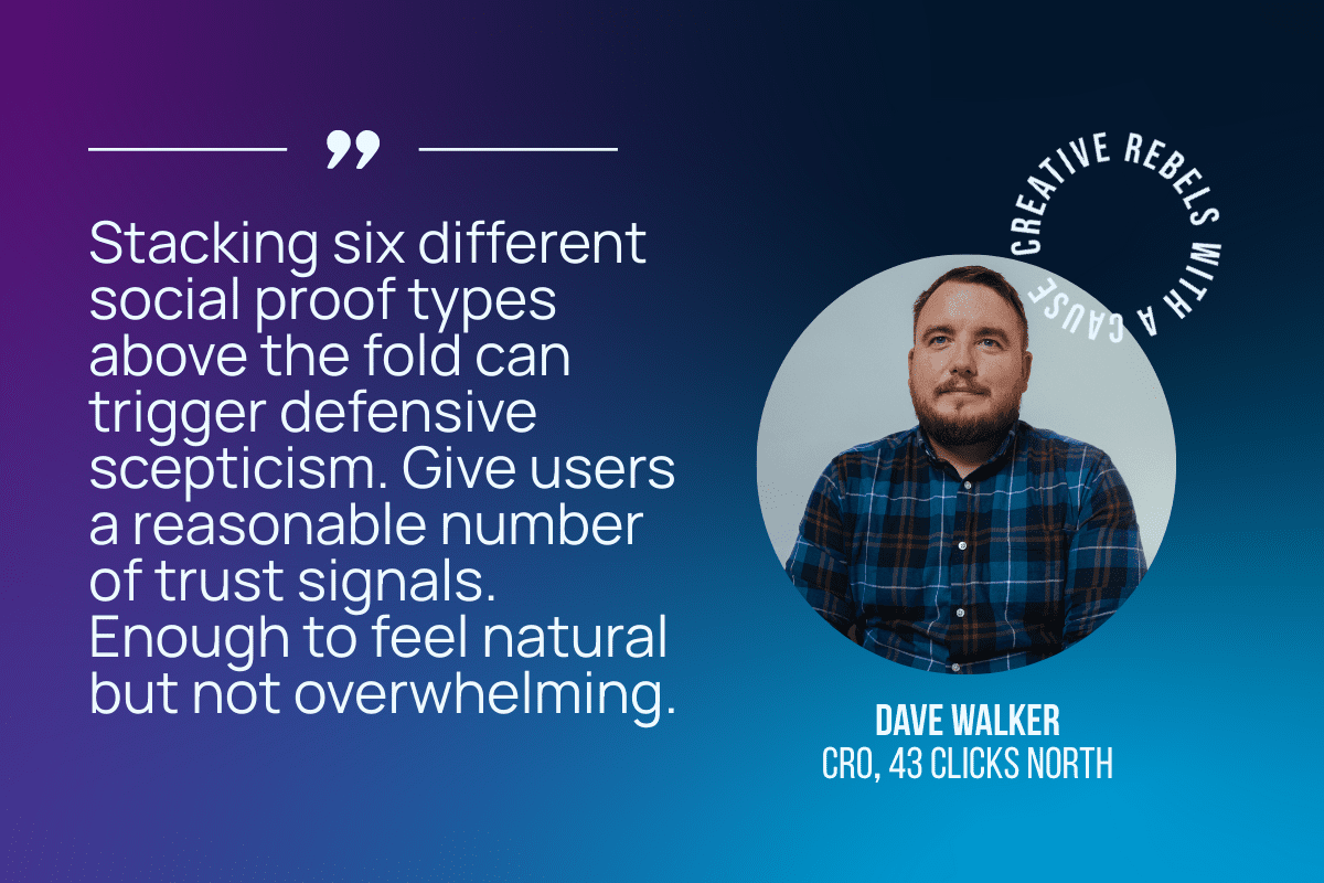
A tip from our CRO Analyst, Dave Walker: Quality over quantity always wins in trust-building, especially for social proof.
Less is often more when it comes to trust signals. Focus on a few strong, authentic testimonials and proof points so users can easily see the value of signing up.
Technical Tips For Social Proof Design
Export testimonial photos and logos at 96 PPI for smaller placements and 144 PPI for larger ones to maintain clarity. Keep logo sizes visually consistent, even when brand shapes vary.
Align all elements to your standard grid and apply the same text styles for names, roles, and quotes so attention stays on the content rather than the layout.
Small inconsistencies make a big difference. Logos that don’t align, uneven spacing, or blurry images create small doubts. Those doubts rarely remain small and can quickly lead users to question the product itself.
Where Brands Often Go Wrong
Social proof sections often fail when:
- Logos appear without context, hierarchy, or visual grouping.
- Too many testimonials are shown at once, creating cognitive overload.
- Quotes lack names, roles, or company information, making them feel anonymous.
- Language sounds scripted, exaggerated, or overly promotional.
- Visual styles change from one testimonial to the next, breaking cohesion.
What Brands Should Do Instead
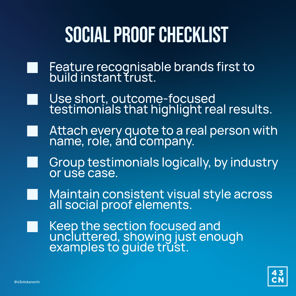
- Show recognisable brands first. Well-known logos act as instant trust anchors and help users suspend scepticism before reading deeper content.
- Use short testimonials focused on outcomes. Statements that reference a specific result or improvement carry more weight than general compliments.
- Attach every quote to a real person with a name, role, and company.
- Group testimonials logically, such as by industry or use case. Grouping helps users find examples that match their own situation.
Social proof is more than just a routine page element. It often persuades more effectively than the brand’s own claims.
Because of this, it deserves careful attention to its presentation, which is key to building trust and creating a high-converting page.
Awards and Badges: Show Verified Authority
People assess a product with a checklist in their mind. Will this expose us to security risk? Will this create compliance issues? Will this choice be questioned later by legal, finance, or IT?
Badges are designed to answer those questions without requiring the user to leave the page or request documentation.
A badge only matters if it represents an obligation the company must continuously meet. Anything else is branding.
Learn from SurveyMonkey’s Placement Design
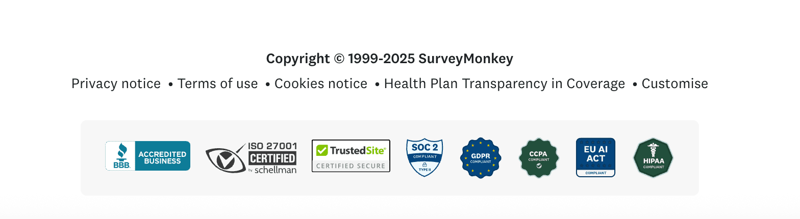
SurveyMonkey’s compliance certifications appear in the footer. Their badges are aligned and grouped under a clear compliance context. They do not interrupt the primary narrative or compete with conversion elements. They sit where users naturally look when they want confirmation rather than explanation.
This placement reflects an understanding of buyer behaviour. Trust concerns tend to surface after interest has already been established. Surfacing compliance too early can slow momentum. Surfacing it too late can stall conversion.
The footer and adjacent pricing areas capture users as they mentally shift from curiosity to evaluation.
Technical Tips For Awards and Badges
Badge assets must remain legible at small sizes, so export them at 144 to 192 PPI to preserve fine detail. Use transparent backgrounds to prevent visual blocks.
Maintain strict consistency in size, border weight, spacing, and alignment, ideally using a precise grid you already follow.
Human perception is highly sensitive to irregularities: mixed flat and dimensional styles, stretched proportions, or uneven borders subconsciously signal sloppiness or inattention to detail. This friction actively erodes trust, as users interpret visual inconsistency as a proxy for operational unreliability.
Where Brands Often Go Wrong
Badge sections underperform when:
- Irrelevant or marketing-driven awards are included.
- Badges are outdated or cannot be verified externally.
- Too many symbols appear at once, creating visual noise.
- Styles, sizes, or borders vary between badges.
- Badges compete with primary calls to action.
For example, a startup displaying an outdated ‘Top Startup 2016’ or a generic ‘Trusted Software’ badge is common and no longer compelling in today's market, especially for SaaS products that must stay current with compliance and security standards.
Simply claiming to be ‘trusted’ without verifiable proof undermines credibility and fails to reassure users of ongoing reliability.
What Brands Need to Do
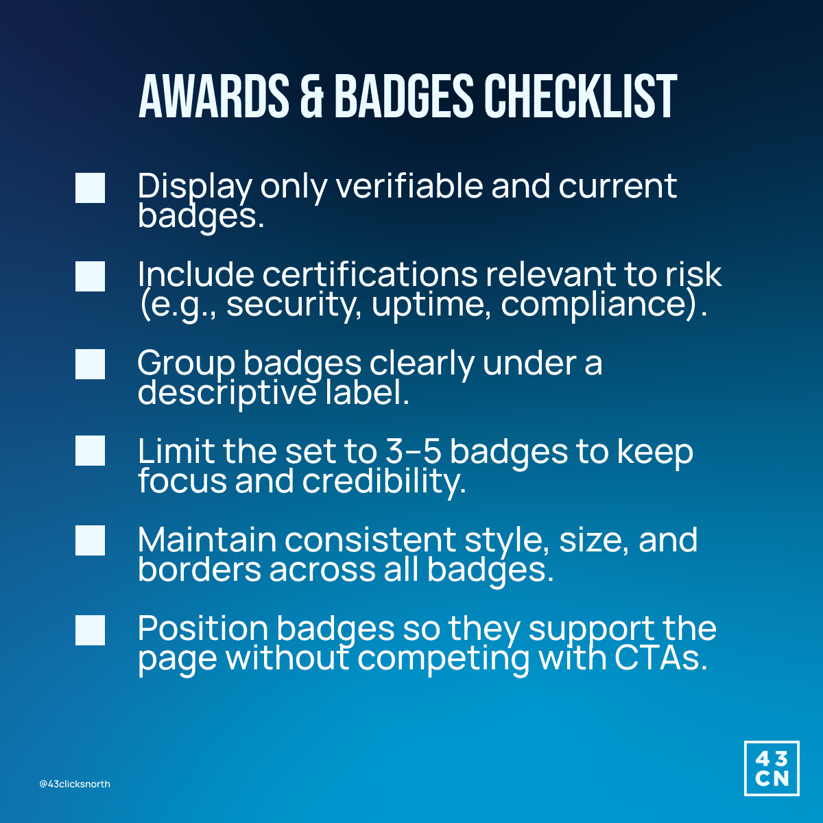
- Show only badges that are verifiable and current.
- Include certifications that directly relate to risk, such as data protection, uptime, or financial security.
- Group badges under a clear label, such as “Security & Compliance” or “Certified Standards”
- Limit the group to a small set. Three to five badges are enough to signal seriousness without overwhelming the page.
Badges are important for SaaS products as they demonstrate the ability to handle sensitive data and meet modern compliance expectations.
These rules will help potential users trust your platform in seconds without diverting attention from the main content.
Integration Logos: Confirm Compatibility
Will this work with the systems I already use?
That is the main question when an interested user is only slightly close to the sign-up page.
Most people still prefer tools they are comfortable with. They check if the software will work with their existing tools, how hard it is to set up, and whether it will disrupt their workflow.
Integration logos quickly signal compatibility and reduce doubt more quickly than text alone.
Learn from Make’s Integration Layout
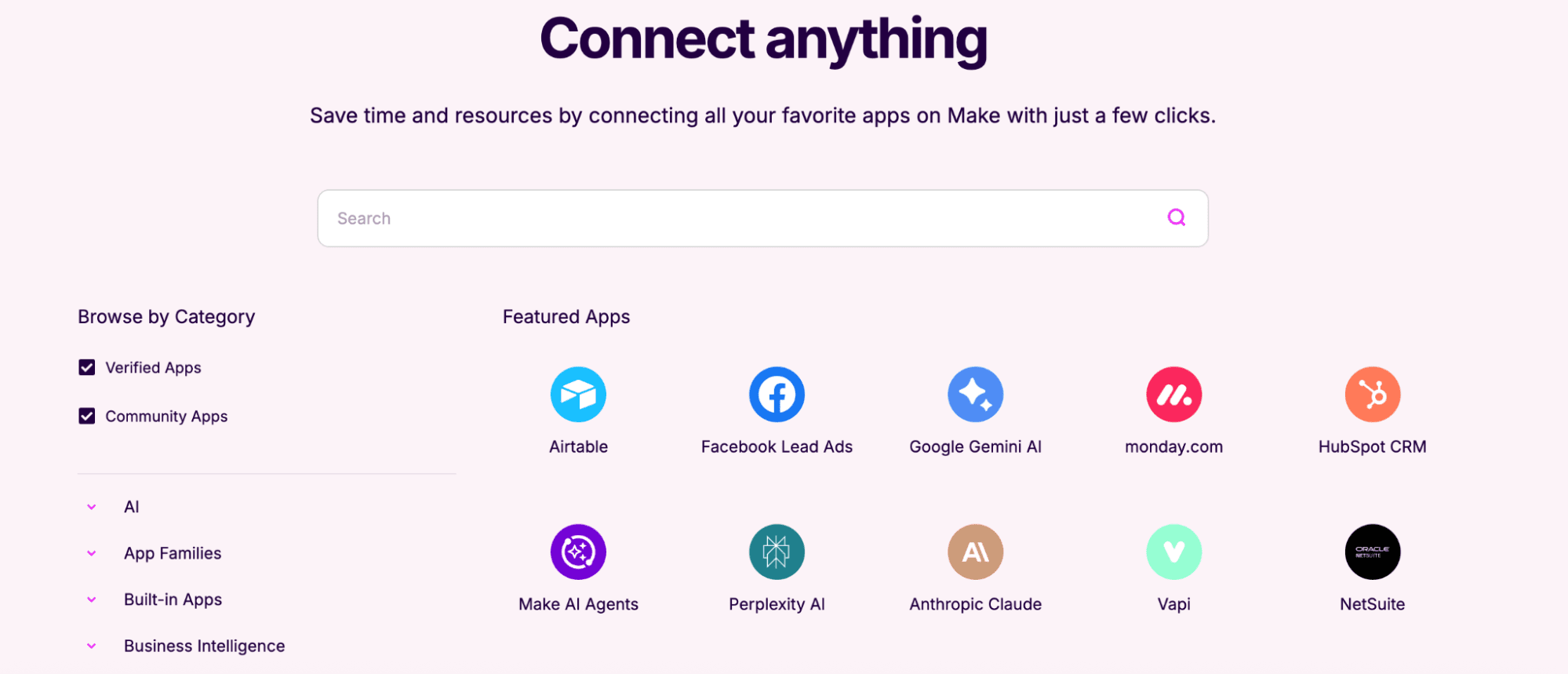
Make the platform’s integration logos displayed in an evenly spaced grid to make scanning effortless. Each logo shares equal visual weight, preventing distraction or inadvertent prioritisation of one tool over another.
Their design pattern includes:
- Equal logo sizing and consistent spacing to maintain visual rhythm and prevent cognitive friction.
- Search functionality for users seeking specific tools, enabling rapid verification without clutter.
- Popular or core integrations are displayed upfront, which immediately signals relevance and builds confidence.
- Extended lists are revealed via interaction rather than cluttering the default view, preserving focus while still offering completeness.
Seeing familiar tools makes users feel more confident, as it signals the software is low-risk and easy to learn.
Technical Tips For Integration Logos
Export integration logos as SVG whenever possible. If raster images are required, use PNG format at 96 PPI for standard placements and 144 PPI for larger or full-width sections. Avoid JPG for logos.
Set a fixed logo height and lock it across the grid. A practical range is 24 to 32 px on desktop and 20 to 24 px on mobile. Adjust the width automatically to preserve the aspect ratio. Never stretch or compress logos to fit a box.
Apply uniform padding around every logo. Use at least 16 px of internal spacing on all sides so logos do not touch or visually collide. Align logos to a baseline or vertical centre, not to their bounding boxes.
Use only official brand assets from partner brand kits. Do not recolour, add shadows, crop, or place logos inside containers that alter their shape.
Where Brands Often Go Wrong
You’ve probably come across pages that use these bad techniques:
- Too many logos appear simultaneously, creating a wall of symbols that slows recognition and overwhelms the user.
- Ordering feels random or arbitrary, forcing users to hunt for relevant integrations and increasing cognitive load.
- No prioritisation or logical grouping is applied, making it difficult for users to assess relevance quickly.
What Brands Should Do Instead
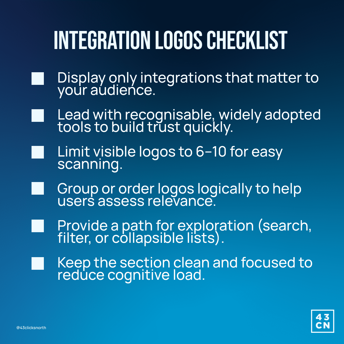
- Show only integrations that matter to the target audience.
- Lead with recognisable, widely adopted tools.
- Limit visible logos to six to ten. Overloading the visual field slows scanning speed and reduces recognition accuracy.
- Provide a path for exploration. Search, filtering, or collapsible lists allow users to validate specific compatibility while keeping the default view clean and focused.
Strong integration sections do not attempt to impress users with volume or novelty. They are curated and strategically ordered to reassure users that the product fits naturally into existing workflows.
Learn more about the other elements that can help brands convert page visitors into users by checking out this article.

Impact of All Conversion Elements Working Together
No conversion element works in isolation. Its effectiveness depends on how well it supports the rest of the page.
Problems appear when teams treat each element as a separate optimisation task. CTAs are tested in isolation. Pricing tables are adjusted without considering how the proof supports the decision. Trust signals are added without regard for placement or context. The result is not a weak page, but a confusing one.
When these elements work together, the decision feels effortless.
Each element reinforces the next, creating momentum rather than friction.
This became clear with Vintage Cash Cow. While not a SaaS product, the service relies heavily on trust and clarity at the moment of commitment. The original page presented too many competing signals at once. CTAs fought for attention. Proof points were scattered. Key reassurance came too late to support the decision.
By simplifying choices, tightening messaging, and creating a clear visual hierarchy among pricing, proof, and action, the page became easier to understand and trust.
- Sign-ups increased by 70%
- Engagement rose by 68%.
The existing ones were brought into alignment.
For teams looking to improve landing page performance, the goal is not to add more content or stronger claims. It is to align what is already there. When the conversion elements share the same tone, structure, and visual logic, the page feels coherent. Ultimately, drives potential users to sign up.
Work With Us
At 43 Clicks North, we help brands create landing pages that convert with confidence. If you are ready to refine your design and turn first impressions into real growth, get in touch with our team.
Keep your page clean, your message focused, and your visitors moving towards action.
Stopped growing online?
We know how to fix that.
We start with your data, not your channels.
Commercial, market, performance, customer and behavioural data, woven into one view rather than five separate reports.
It shows where your profit comes from, which activities earn their place, which are dead weight, and what's worth doing next.
We typically find 15-30% in wasted marketing spend in the first 3 months.
Channels are the tools; making your business more money is the objective.
Latest News
See all
5 Conversion Blockers That Hurt Black Friday Sales
Shoppers are ready to buy this season, but site blockers can send them to competitors. Discover 5 mistakes to avoid and how to fix them.


5 Strategies to Boost Ecommerce Landing Page Conversions
Your ecommerce landing page is critical in the success of your online store. Join 43 Clicks North as we share our tips on boosting your conversion rates.

How building/nurturing communities can benefit your brand
One of the most enigmatic marketing strategies, has always been communities. Find out how building & nurturing communities can benefit your brand with 43CN.