
How to Showcase a Software Product on Landing Pages


Product presentation is one of the strongest drivers of trust on a landing page. Retail studies show that the quality of product information and visuals influences 85% of consumers' purchase decisions. The same behaviour appears in SaaS because people often rely on what they can see.
People want to understand what the software looks like, how it works and how it will fit into their workflow. If they cannot visualise daily use within a few seconds, trust declines and hesitation increases.
This guide will walk through a practical, structured approach to showcasing brands’ platforms. Teams will learn how to craft visuals that feel professional and authentic and how to avoid the most common mistakes that weaken credibility.
Start with a Clear Product View
The first few seconds on a landing page matter more than most people realise, so the hero section should present an accurate, high-quality view of the product.
Use a simple composition: a short headline, a strong call to action, and one clear product screenshot.
You do not need crowded visuals or layers of shadows. The more comfortable it is to the eyes, the better.
Attio exemplifies this approach. Their homepage features a six-word headline, a brief description, and a direct CTA. The CRM interface is set on a light background.
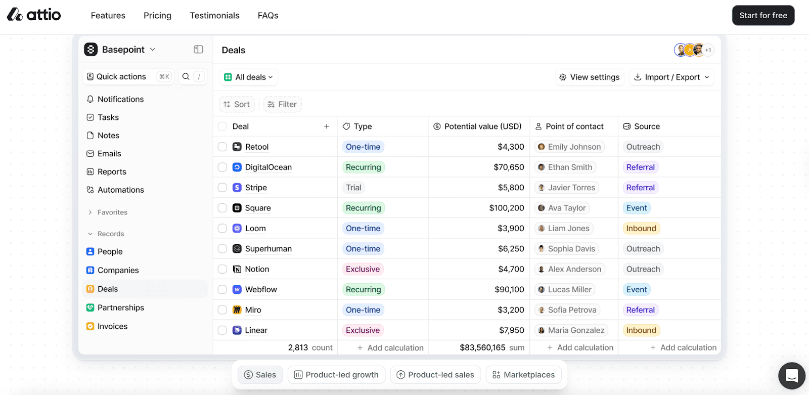
The dashboard is sharp and is easy to recognise, and every element sits naturally within the page grid. This gives the impression that the product is stable and ready to use.
To keep the hero section clear and credible, focus on the following:
- Export the hero visual at high resolution. Aim for at least 192 PPI to support retina and 4K screens.
- Use modern image formats such as WebP or AVIF. These reduce file size without hurting visual quality.
- Scale the image to full desktop width. This shows enough interface detail without forcing users to zoom.
Although visual effects can be attractive, make sure not to use heavy motion too often with dark gradients. These additions pull attention away from the interface and create visual noise.
Some companies add a cropped screenshot that hides navigation bars or key tools. This casts doubt on the overall experience. A visitor who cannot see the platform’s structure cannot fully understand the workflow.
A page that looks artistic is not always a page that drives conversions.
If you keep the focus on the interface and present it honestly, visitors will feel more confident as they scroll.
Highlight Key Features with Simple Labels
Once the hero section sets the foundation, the next task is to guide the visitor through the product. Feature callouts can help achieve this without overwhelming the viewer. The idea is to identify specific functions clearly. Instead of making someone read a long description, highlight the most important areas so they can recognise value at a glance.
A callout works best when it feels subtle and supportive. Rounded boxes, thin lines and balanced spacing help maintain harmony in the layout. A callout should be like:
- “Automates weekly reports in one click”
- “Shows real-time usage across all teams”
- “Edit permissions without admin access”
- “Syncs data every 15 minutes”
- “Designed for non-technical users”
These do not feel like sales stickers that shout for attention. It should feel like a guide pointing to something meaningful.
Always use short active phrases that express benefits. Instead of naming a feature with a label like "Task Panel," use a label that reflects the result, such as "Manage tasks in one view." This immediately explains why the feature matters.
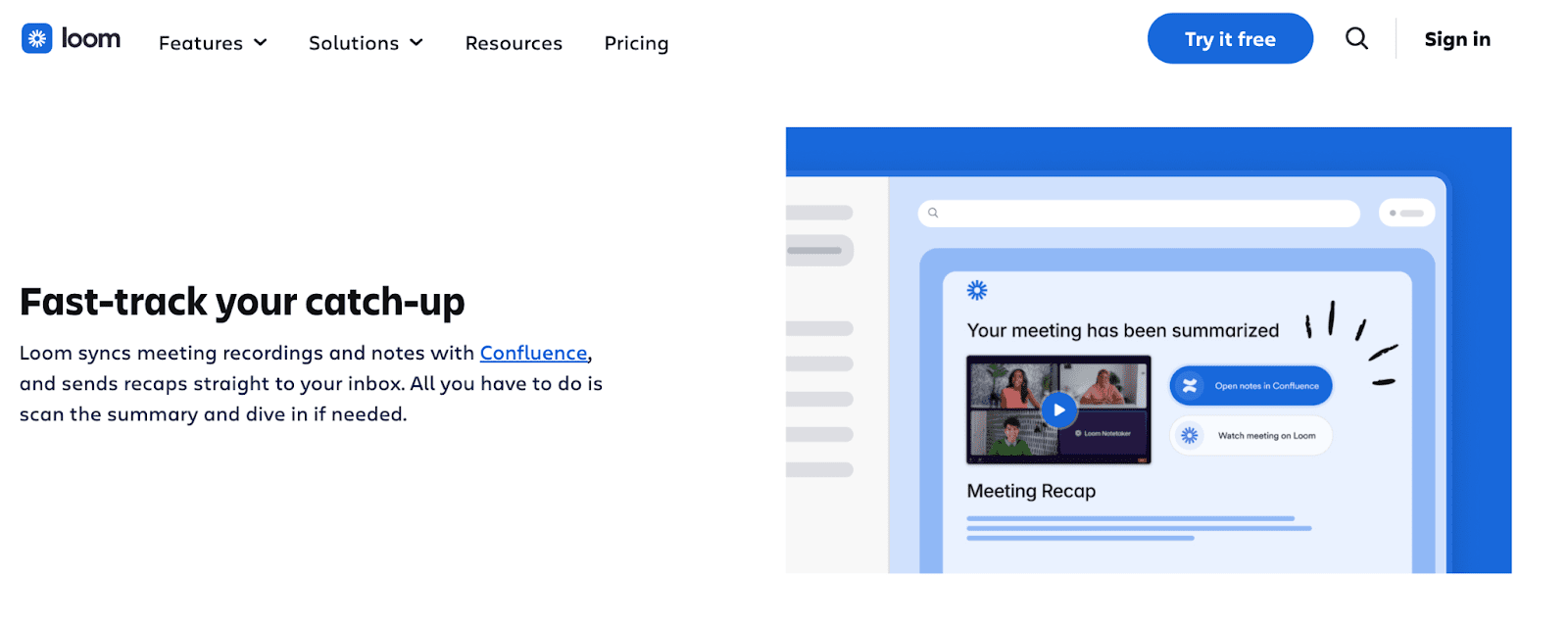
Loom uses this technique on its homepage. Their visuals are clean, and the wording is concise and clear.
The homepage shows the platform in use and adds a caption that immediately explains the value. The spacing between text and interface elements also feels comfortable. A layout like this is easy to scan and absorb.
To execute callouts cleanly and avoid visual noise, follow these rules:
- Set callout text at a minimum of 16px so it stays readable at a glance.
- Align callouts to a consistent grid so they feel intentional, not dropped in.
- Reveal feature callouts gradually using light animations or hover states.
Overuse will always be the number one mistake in callouts. When every corner of the interface is labelled, it becomes a chaotic map of arrows and floating text that overwhelms users.
Research on interface complexity shows that as visual elements increase, users fixate more and struggle to process information efficiently, meaning clutter directly hampers comprehension and attention allocation.
Because people can hold only a limited number of elements in short-term visual memory, designers should avoid inundating pages with callouts and instead select only a few essential features.
Limit callouts to one or two at a time. This will not split the attention, weaken the hierarchy, nor make the page feel busy.
Use Short Demo Videos to Show Workflows
A high-quality demo video is one of the most powerful elements for convincing someone to explore your platform.
62% of video marketers say videos have reduced support queries by showing users exactly how the product works.
A good demo video stays short and focused. Aim for a duration between 30 and 120 seconds, and should include many of these elements:
- Show the core task from start to finish using real interface screens.
- Use realistic data to make the product feel credible and familiar.
- Focus on one primary workflow.
- Keep the cursor visible and movements calm so actions are easy to follow.
- Zoom only when needed to show detail, then return to the full view.
- Add short captions that explain intent.
- End with the result the user achieves, such as time saved or fewer errors.
This will help the viewer understand how the tool immediately fits into their daily work. Remember, our goal is to make things fast and easy, so interested viewers will move naturally into signing up.

Another SaaS platform that is a good example of showing demo videos is Miro.
The video shows the interface in motion, making the workflow easy to follow. They also include a live capture of someone using the platform, which adds a layer of authenticity.
To make your demo video user-friendly and accessible, follow these guidelines:
- Record in a 16:9 ratio and export in 1080p for clear, consistent visuals.
- Place the play button clearly in the centre of the thumbnail so visitors can start the video instantly.
- Avoid autoplay with sound, which can annoy users and lead to page exits.
- Let the user control playback to respect their pace and keep the experience comfortable.
Some brands use slow-motion clips featuring generic office scenes rather than real product interactions. Others show people clicking through screens without explaining what is happening. Without context, the viewer sees movement but does not understand the meaning. Maybe in those old days, they were amazing, but now they hold little to no value.
People want instant value, so present product information clearly and directly. A well-crafted demo video not only answers their questions immediately but also reinforces the brand, highlights the product’s value, and lets viewers experience it firsthand.
When done right, it reduces the effort required to understand your tool and lowers the barrier to conversion.
Zoom in on Important Interface Details
Interested visitors often want to know how specific parts of the software function. This is where detailed interface previews are useful. These previews focus on a single area, such as analytics panels, settings pages, dashboards, or detailed interactions.
It should zoom in enough while retaining enough of the surrounding context so the viewer knows where they are in the product.
A detailed preview works best when it isolates a meaningful action. For example:
- Highlight a drag-and-drop action within an editor.
- Show validation feedback inside a form.
- Demonstrate how a report updates when filters change.
These small moments communicate the experience more clearly than a full-page screenshot. They convey precision and attention to what really matters.
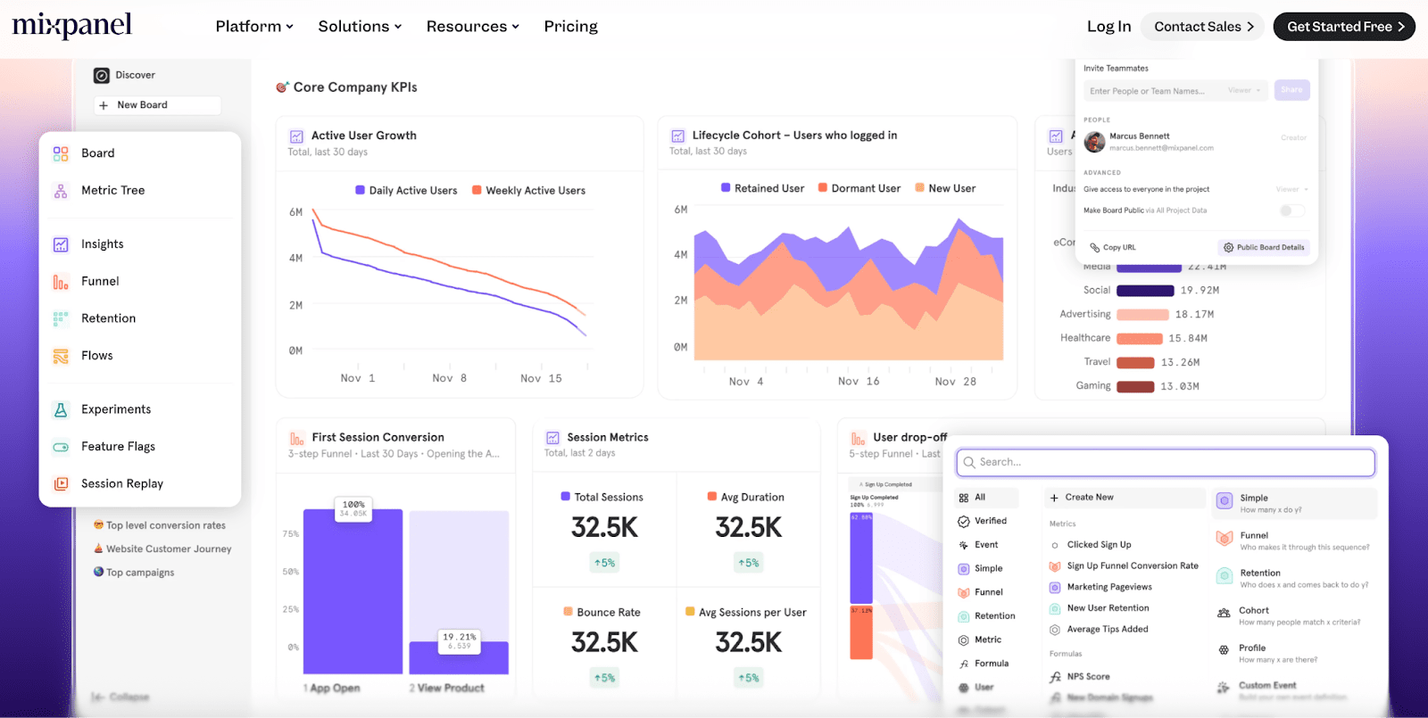
Mixpanel does this effectively with its analytics previews. Every chart is legible, every label is clear, and the table looks structured.
The viewer immediately understands what the tool measures and its specific functions. The clarity in these previews creates instant relevance.
To create clean, professional previews, follow these guidelines:
- Use a design tool grid (like Figma or Sketch) and snap all previews to it.
- Set uniform margin values (e.g., 24px on all sides) and apply them to every visual.
- Apply consistent padding to the boxes around each preview layer to ensure spacing is even without manual adjustments.
The biggest mistake designers make is stretching or shrinking interface elements to fit a layout, which distorts the product and misrepresents its interface. This issue extends to text within the visuals.
If a preview contains labels, buttons, or any UI copy, resizing can make the text too small, too large, or uneven across images.
All previews should use the same font size, weight, and style, and any interface elements should remain proportional to the original design.
Pair Screenshots and Copy for Clarity
A screenshot or a clear video is powerful but remains incomplete without words that explain the benefit. When the two channels reinforce each other, understanding improves, and decision-making becomes easier.
In fact, this pairing supports what we have done for one of our clients, Stone Refurb. We achieved a 15% growth in conversion by placing strong copy and visuals above the fold on their website.
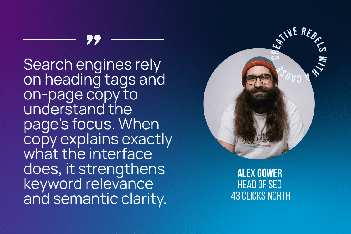
Pairing image and copy also supports SEO performance. Alex Gower, Head of SEO, explains that when images lack overlaid text or descriptive alt text, search engines have very little information to interpret the page.
Screenshots with meaningful alt text reinforce this, giving search engines additional context without relying on long blocks of text.
To create a clear and trustworthy layout, follow these guidelines:
- Place visuals and text within a consistent grid system, such as a twelve-column layout.
- Keep body text between 16 and 18 pixels for easy readability.
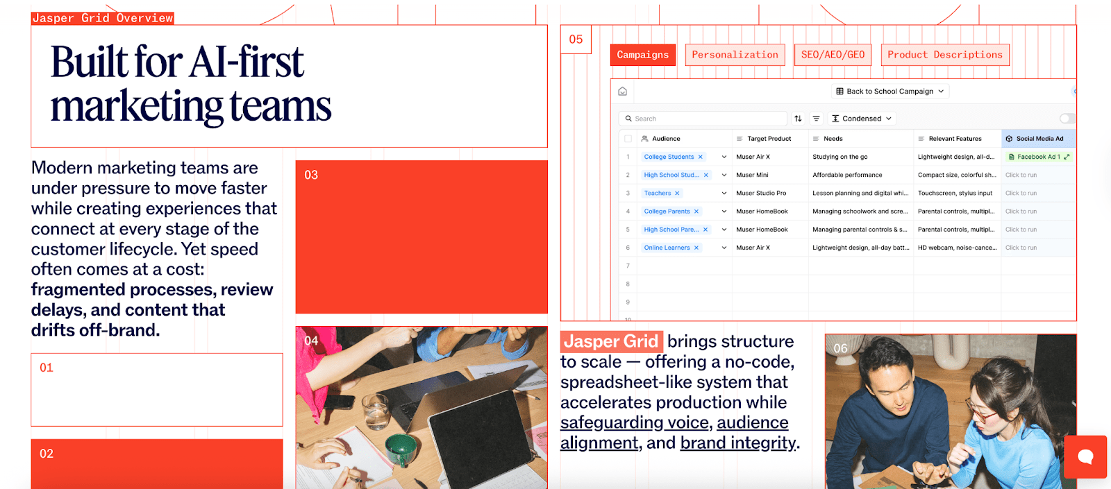
- Maintain strong colour contrast, aiming for at least a 4.5:1 ratio between text and background for normal text, and 3:1 for large text.Jasper provides a strong example. Their headline expresses value clearly. The product visuals appear immediately under the text, creating a direct link between the promise and the product.
Jasper provides a strong example. Their headline expresses value clearly. The product visuals appear immediately under the text, creating a direct link between the promise and the product.
Secondary descriptions explain how the platform helps teams work faster and address their pain points.
Some brands take the opposite approach. They use vague headlines that offer little insight into the workflow or what the platform solves. Their hero visuals look busy, and the call to action, such as “Learn More”, does not create motivation.
If you talk about time saving, show the action that reduces manual work.
If you talk about automation, show the part of the interface where automation rules run.
If you talk about integration, show how data flows across tools.
This makes your claims believable.
Brands also need to think about reading flow. People do not read every word on a page. They scan for cues that guide their attention. A strong visual gives them a place to stop while the copy offers context. This builds momentum, and momentum is one of the hidden drivers of conversion.
When visuals and copy align clearly, visitors feel informed and are more willing to take the next step.
How to Test if Visuals Show Product Value
Testing reveals whether your page is as intuitive as you expect. You can run several small tests without needing complex research.
Step 1: The five-second test.
Designers often struggle to judge their own work after repeated revisions, as familiarity can make it hard to see issues objectively. A simple way to check clarity is to have a colleague or someone from another department review the design using the five-second test.
This gives you feedback from fresh eyes, simulating a user perspective, without the need for an external survey.
The five-second test gives users enough time to form an impression and make a basic judgment. While studies show that people form initial evaluations in under 50 ms, allowing five seconds provides a safer window to absorb key elements and consider the overall layout and message without rushing.
Step 2: Observe how people scan the page.
Use screen recording tools (such as FullStory or Hotjar) or heat-mapping tools to track where visitors pause, scroll, or hover.
Pay attention to areas where users hesitate, backtrack, or miss key elements such as CTAs, headlines, or feature highlights.
Step 3: Run A/B tests and compare different versions
Test specific variations of screenshots, callouts, or video thumbnails to see which performs best. For example:
- Crop the interface differently to highlight key features.
- Change the wording, size, or placement of callouts.
- Adjust colours, contrast, or font for better readability.
- Test different video thumbnail frames to see which attracts more clicks.
- Try using an alternative background or padding around visuals to reduce clutter.
Small adjustments often have a big impact, and repeated tests help you establish a clear standard for future visuals.
Every scroll, glance, and click tells a story. Make sure yours is the one that visitors want to read.
Work With Us
Beyond properly displaying your software, there are additional technical considerations you should understand.
At 43 Clicks North, we help brands create landing pages that convert with confidence. If you are ready to refine your design and turn first impressions into real growth, get in touch with our team.
Stopped growing online?
We know how to fix that.
We start with your data, not your channels.
Commercial, market, performance, customer and behavioural data, woven into one view rather than five separate reports.
It shows where your profit comes from, which activities earn their place, which are dead weight, and what's worth doing next.
We typically find 15-30% in wasted marketing spend in the first 3 months.
Channels are the tools; making your business more money is the objective.
Latest News
See all
5 Conversion Blockers That Hurt Black Friday Sales
Shoppers are ready to buy this season, but site blockers can send them to competitors. Discover 5 mistakes to avoid and how to fix them.


5 Strategies to Boost Ecommerce Landing Page Conversions
Your ecommerce landing page is critical in the success of your online store. Join 43 Clicks North as we share our tips on boosting your conversion rates.

How building/nurturing communities can benefit your brand
One of the most enigmatic marketing strategies, has always been communities. Find out how building & nurturing communities can benefit your brand with 43CN.